
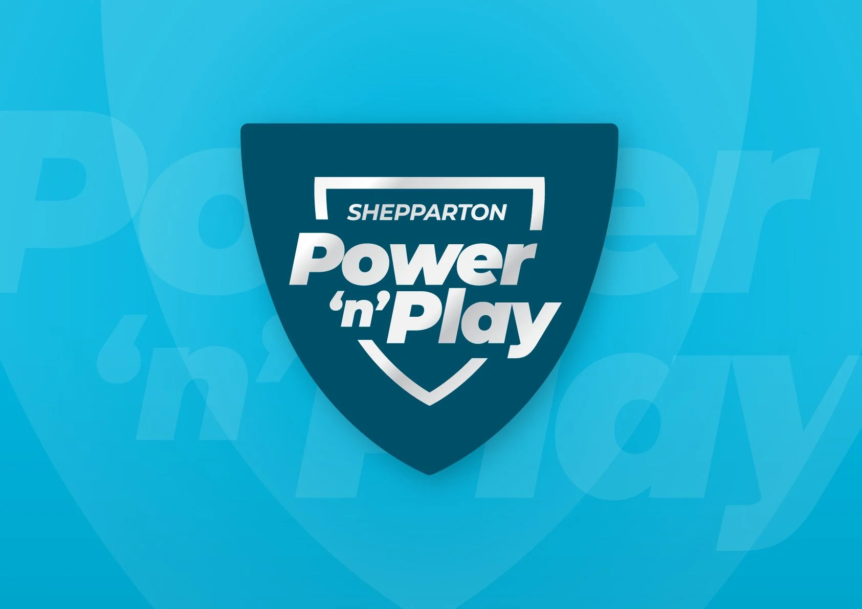
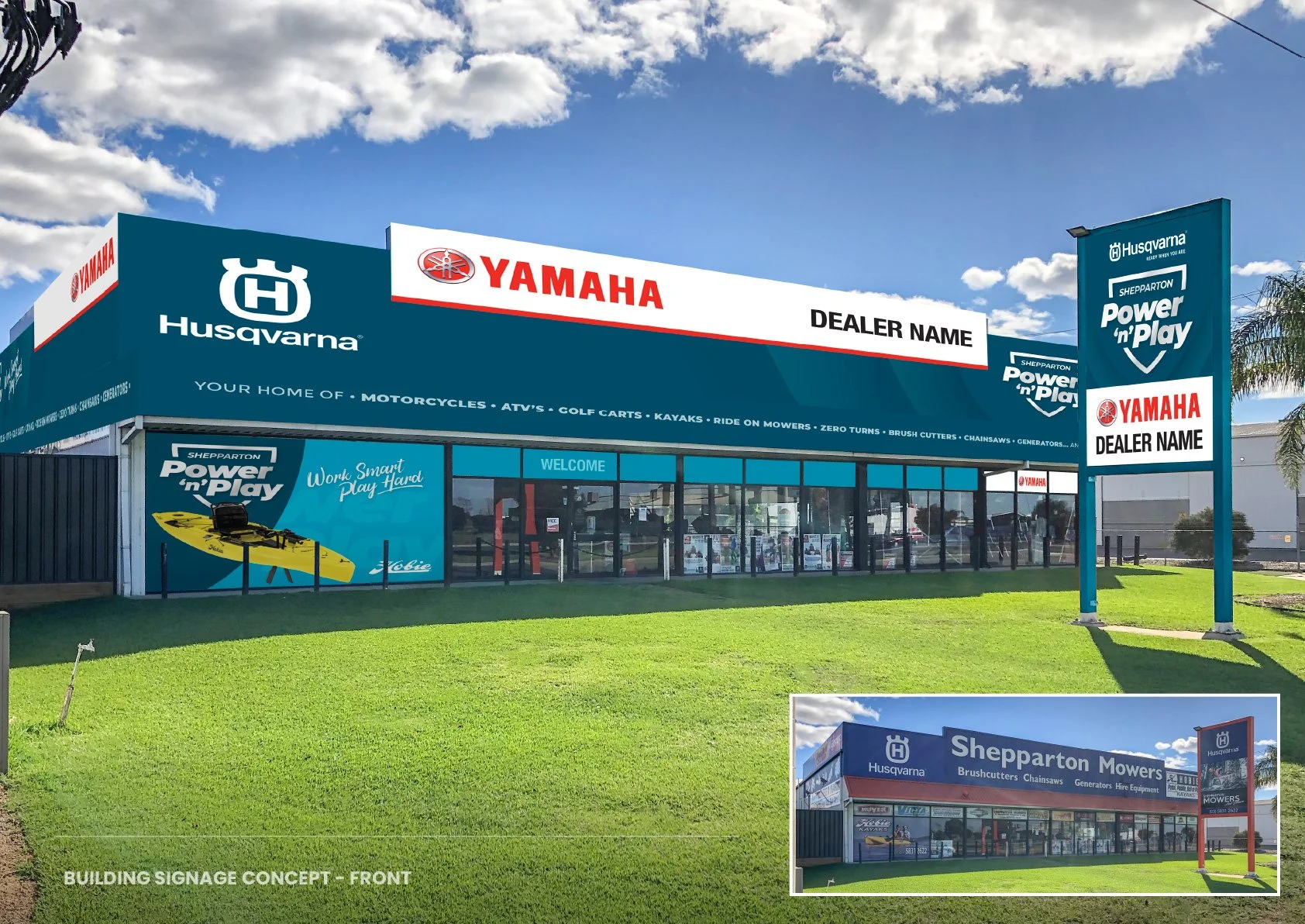
Identity Design for Power'n'Play
Identity design for Power’n’Play
The Brief:
New Identity for: Power ‘n’ play
Power ’n’ Play is a new name for Shepparton Mowers & Leisure. A business that sells and services mowing, garden and leisure equipment. This includes brands such as; Husqvarna, Yamaha Motor & Hobie Kayaks.
The new ‘Power ’n’ Play’ logo is to be clean, versatile and recognisable. It is to portray a sense of boldness and strength whilst maintaining a sense of professionalism. The intent is to eventually have multiple store outlets/locations so the design needs to look professional and consistent when compared to larger, franchise opposition. The design is to work well across all mediums; From large Billboard signage to small social media icons.
It was discussed to consider using blue colour tones as currently used by Shepparton Mowers & Leisure although a variation on this will be considered. It’s important the colours chosen are to compliment supplier brands.
Keywords of the design focus: • Boldness • Strength • Power • Playful • Lifestyle • Professional • Versatile
The Solution:






Identity Design for GRPSA
Identity design for Goulburn Region Pre-school Association (GRPSA)
The Brief:
New Identity for:
Goulburn Region Pre-school Association (GRPSA)
GRPSA provides quality early childhood educational programs in rural Victoria. With 16 locations providing Kindergarten, Pre-Kinder, Occasional Care & Long Day Care for children aged 0–5 years of age. A key focus on providing a safe, exciting, engaging environment for children, families and educators.
GRPSA Core Values:
• Inclusion • Respect • Open and Clear Communications • Continuous Improvement • Advocacy • Sustainability
The following are some keyword discussed for consideration as part of the logo development:
• Rural Setting • Nature • Natural Growth • Child Development • Community Involvement
• Early Learning • Fun/Enjoyment • Inclusiveness
It is important the new design is clear and versatile. It needs to be easily recognisable and if possible include element(s) that can visually connect with values and/or services and/or keywords discussed. The design will be used in a variety of mediums including; signage, print publications, digital publications, websites and social media. It was discussed that the use of the acronym: ‘GRPSA’ to be considered if it is deemed to help create a recognisable brand mark.
The key priorities of the new design are:
Clear, versatile, fun & excitment.
The Solution:


Choice Real Estate – Re-Brand
Choice Real Estate – Re-Brand
Rebrand for Choice Real Estate


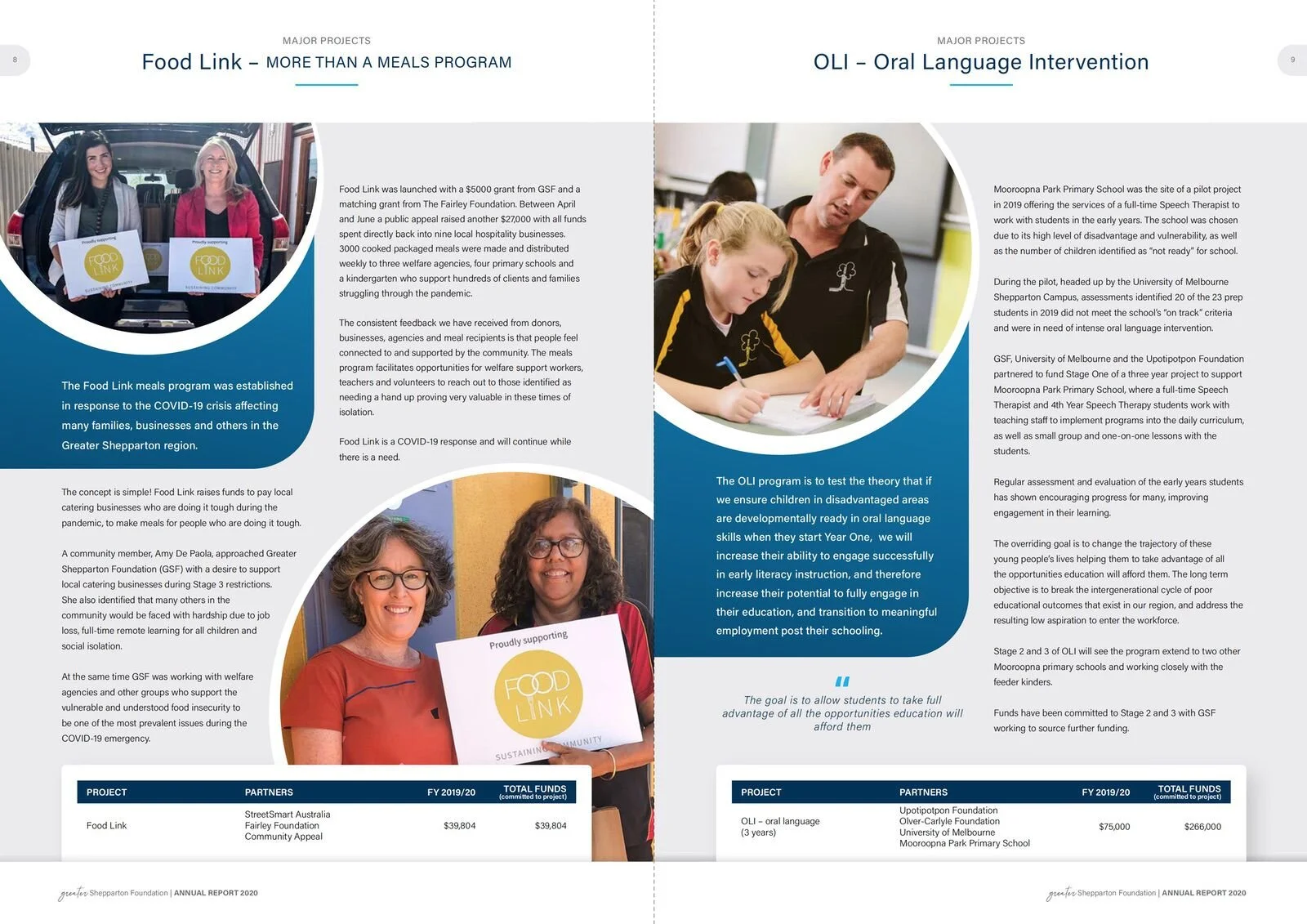
Greater Shepparton Foundation - Annual Report
Greater Shepparton Foundation - Annual Report
Greater Shepparton Foundation - Annual Report 2020









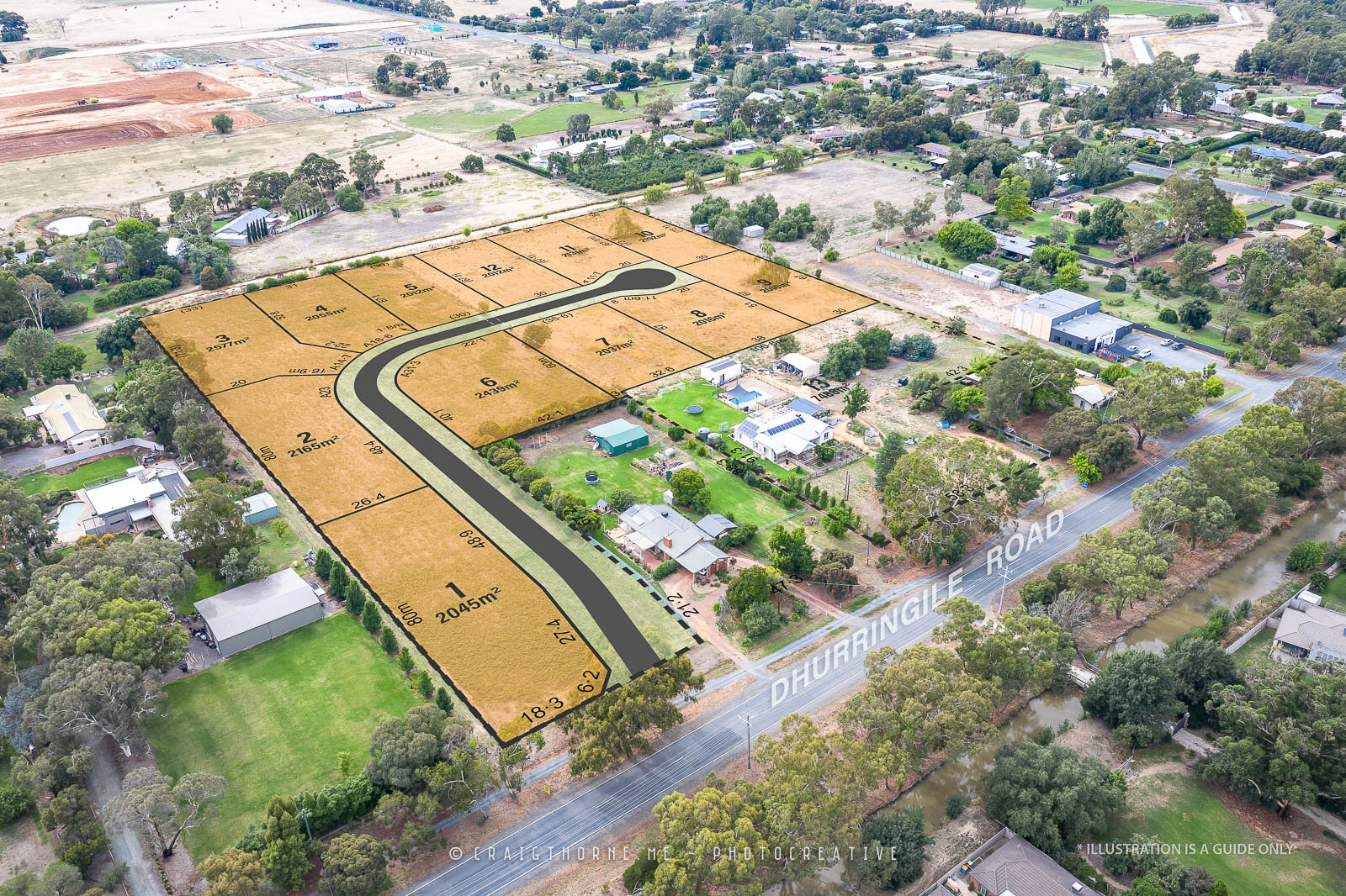
Apricot Court Tatura
Apricot Court Tatura



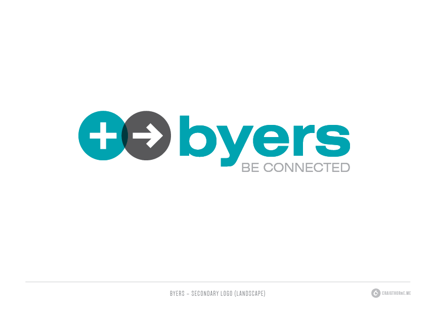
Byers Electrical Rebrand
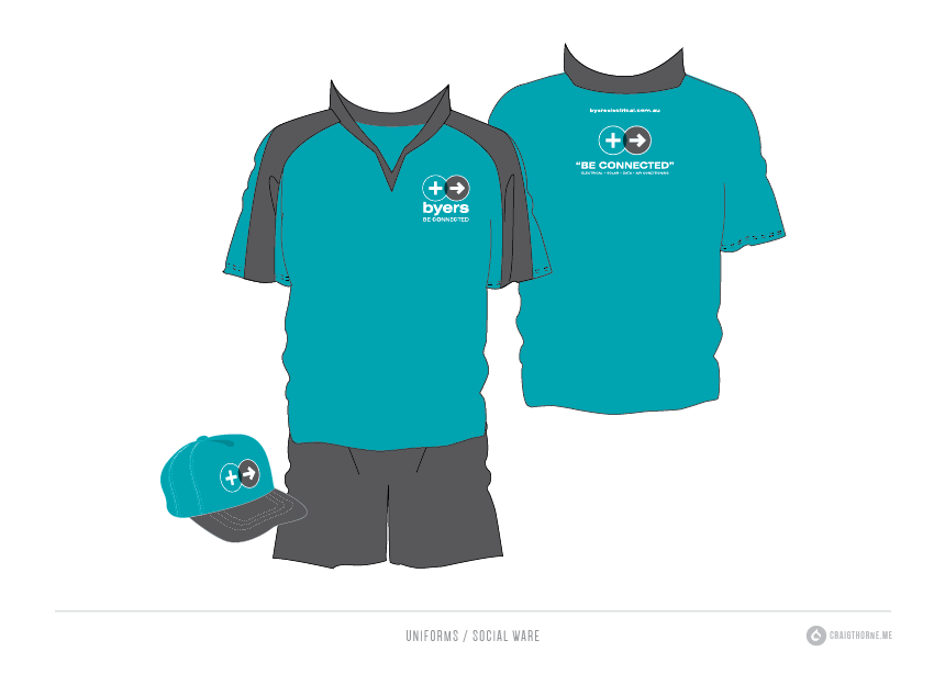
Byers Electrical is a family electrical contracting business based in Shepparton and Bendigo. They provide solar, electrical, data and air conditioning services.
Byers Electrical is a family electrical contracting business based in Shepparton and Bendigo. They provide solar, electrical, data and air conditioning services.

SJB Ag-Nutri
Sales / Product Brochure for SJB Ag~Nutri.
Sales / Product Brochure for SJB Ag~Nutri.


Coast to Country Financial Planing – BRANDING
Coast to Country Financial Planing – BRANDING
Coast to country FINANCIAL planning – BrandING


Berries Australia Magazine
Berries Australian Magazine Concept
Magazine Concept
for Australian Berry Industry.
Design concept by Craig Thorne


S&T Smith Installations – Blind Installers Identity Design
S&T Smith Installations – Blind Installers Identity Design
S&T Smith Installations – Blind Installers Identity Design


Kevin Hicks Real Estate
Kevin Hick Real Estate Marketing Refresh.
Kevin Hick Real Estate agency approached me to help update their marketing colateral with a new, consistent style. They wanted something fresh, modern and maximise impact on their property signage. It was important to keep existing logo and company colours.
Kevin Hicks Real Estate Marketing Refresh.
Kevin Hicks Real Estate agency approached me to help update their marketing colateral with a new, consistent style. They wanted something fresh, modern and maximise impact on their property signage. It was important to keep existing logo and company colours.
– THE SOLUTION –
We made slight adjustments to the exisiting logo to improve readability. New signage was designed to be clean and bold. Press ads were also design to ensure consistency can be achieved easily across multiple publications and digital marketing formats.


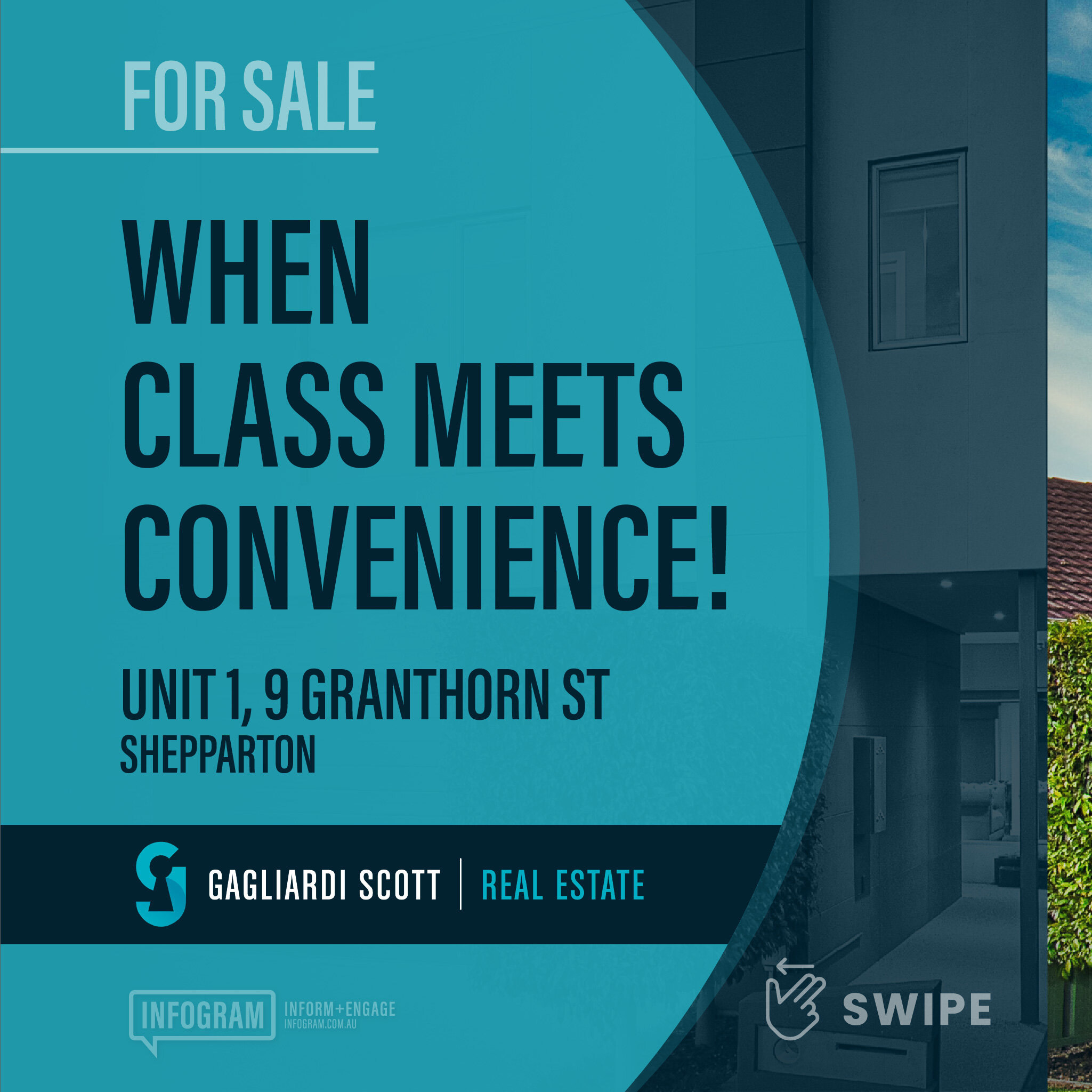
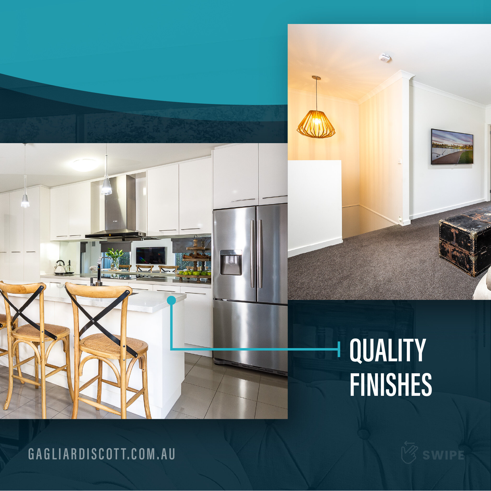
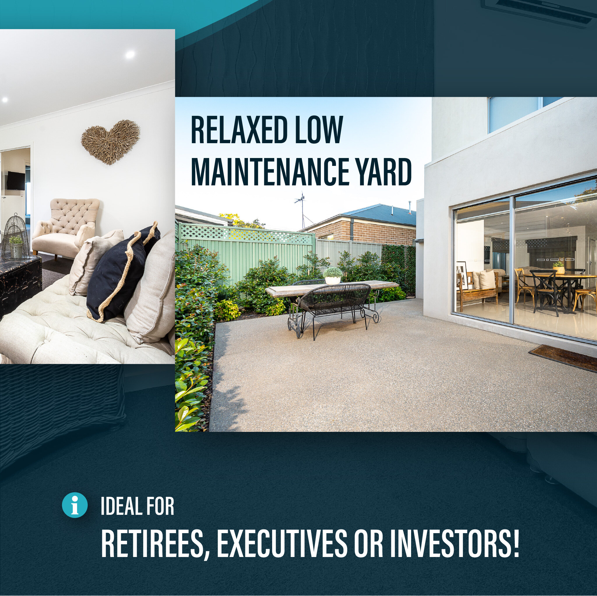
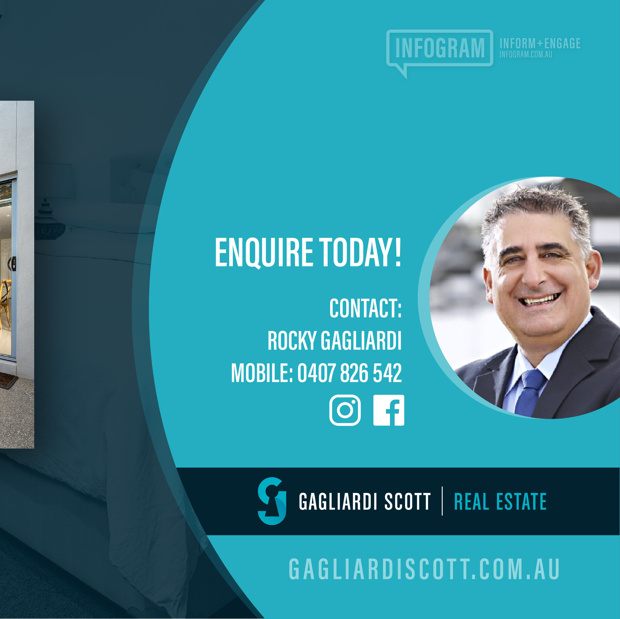
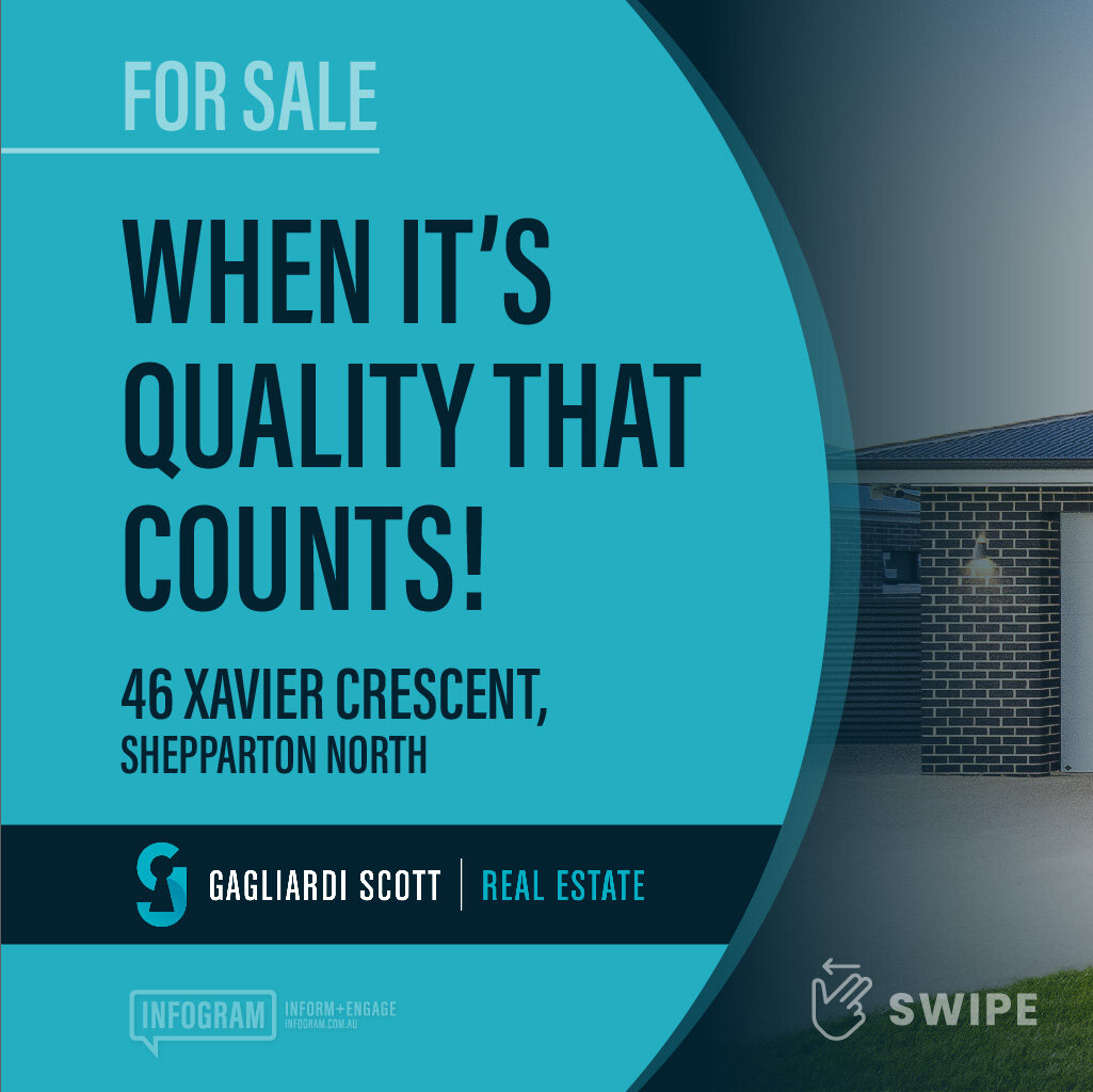
Infogram - Gagliardi Scott Real Estate
Infogram - Gagliardi Scott Real Estate
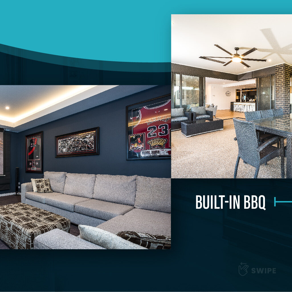
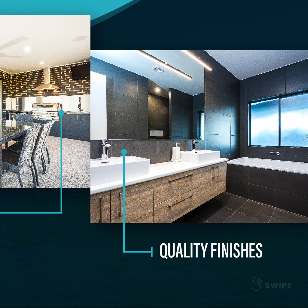
INFOGRAM - Social Media Promotional Graphic Slides
Designed to increase social media engagement.

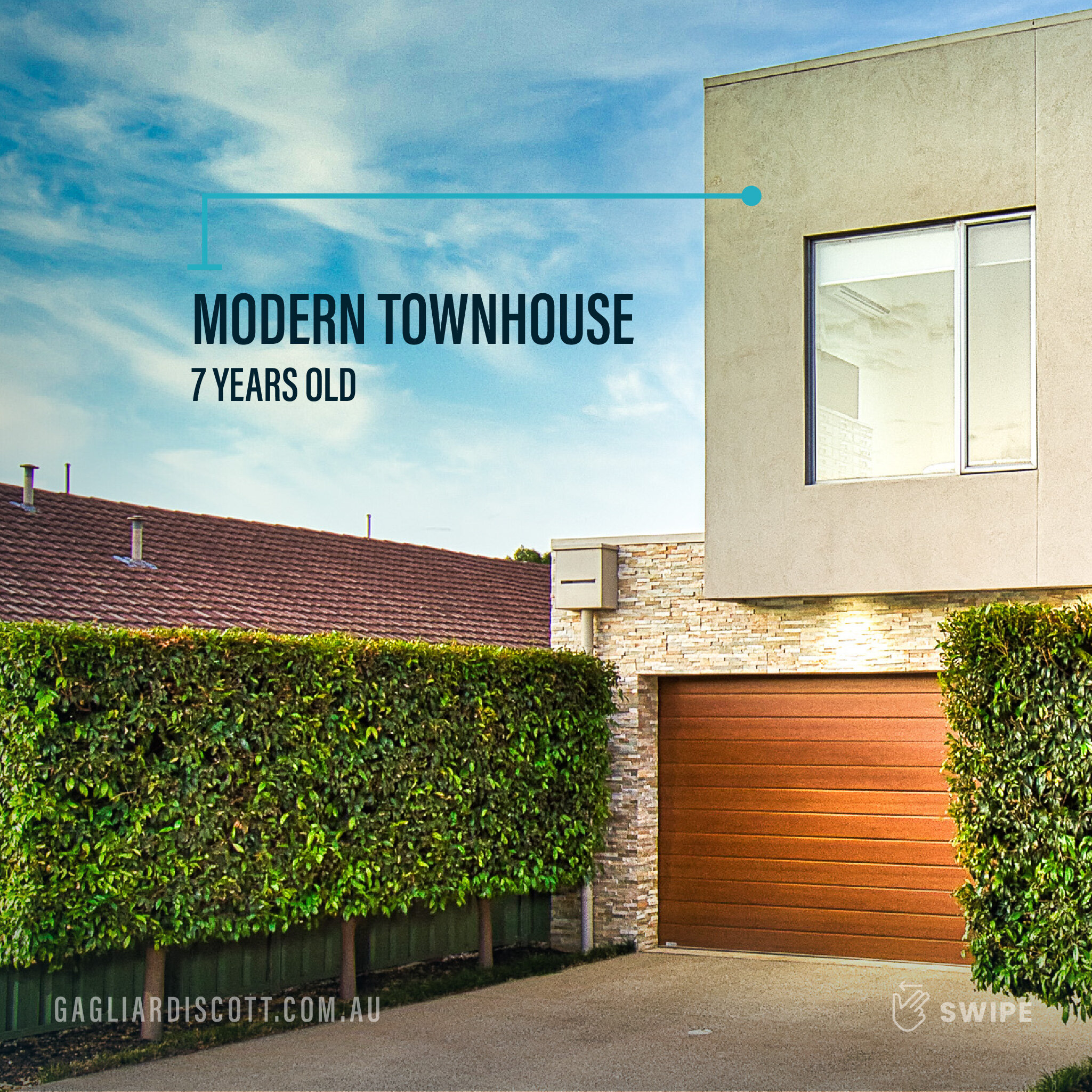
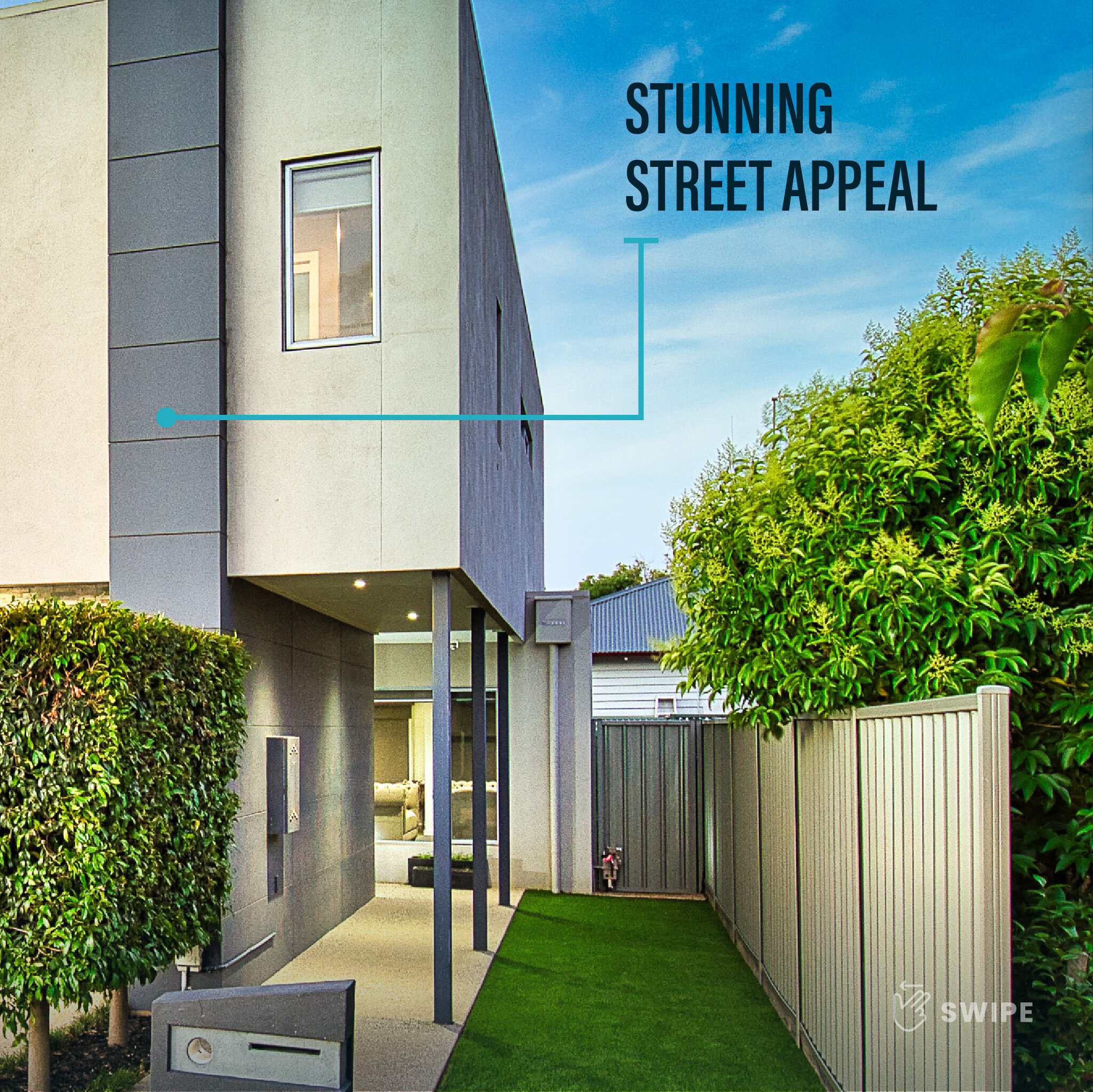
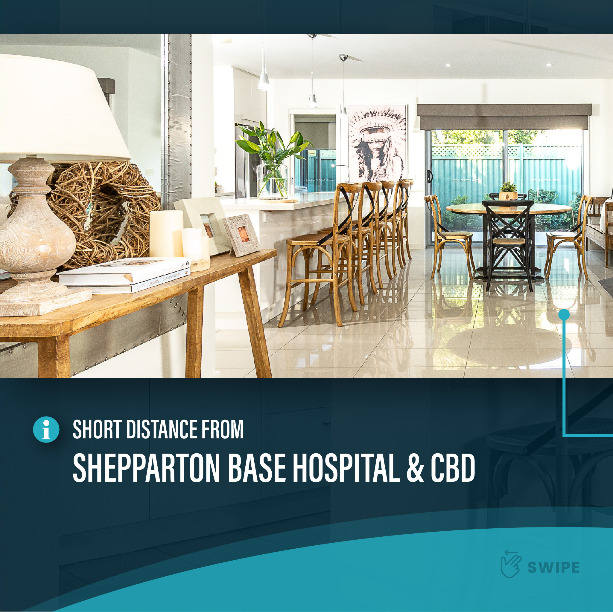
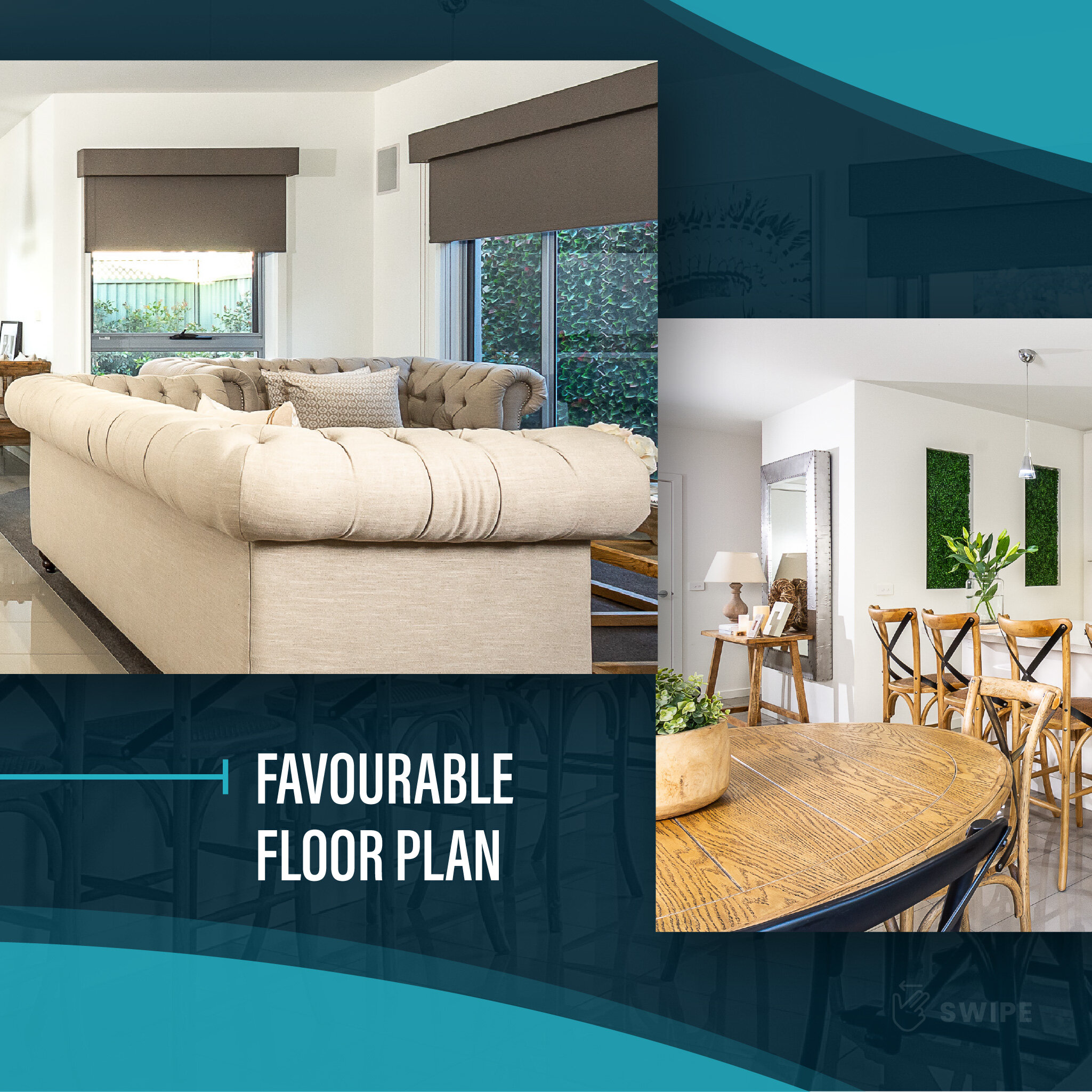
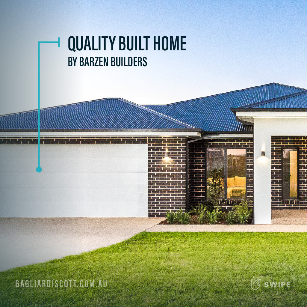
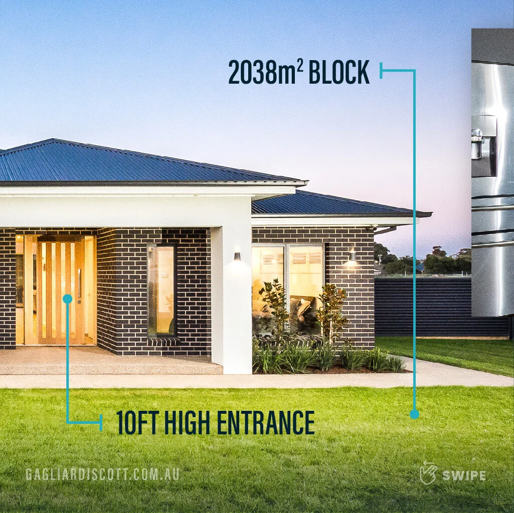
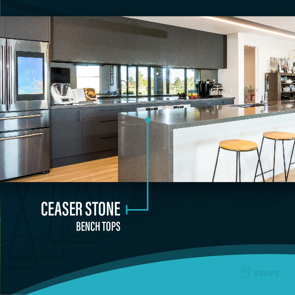
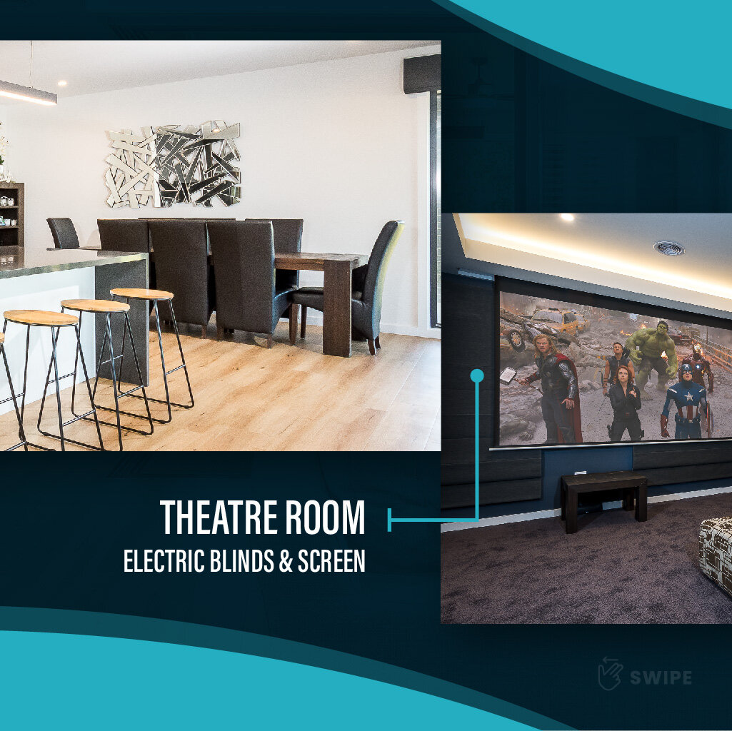

Immediate Media Management
Immediate Media Management
Immediate Media Management Logo & Business Card Design


Immediate Media Management – Website Landing Page

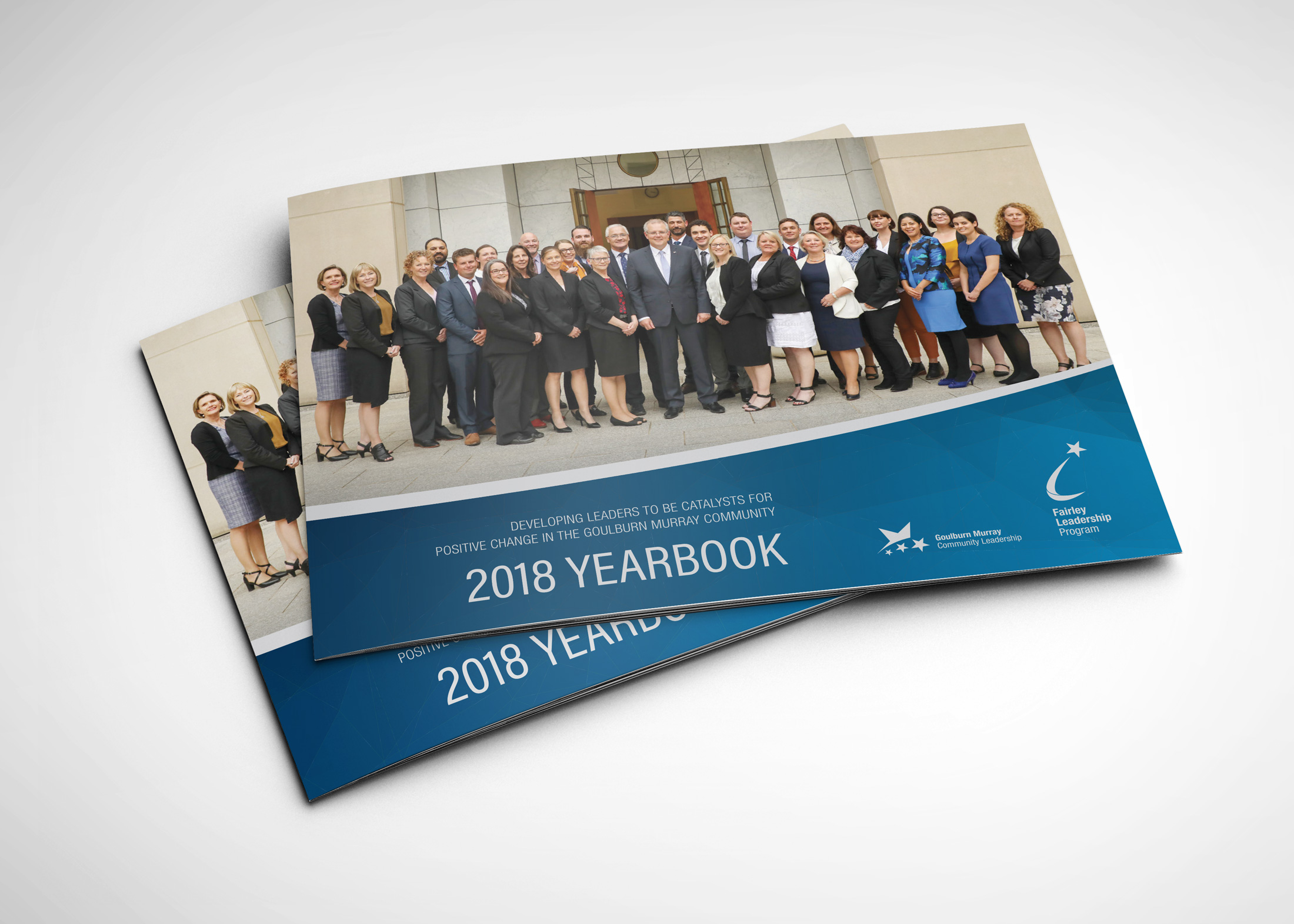
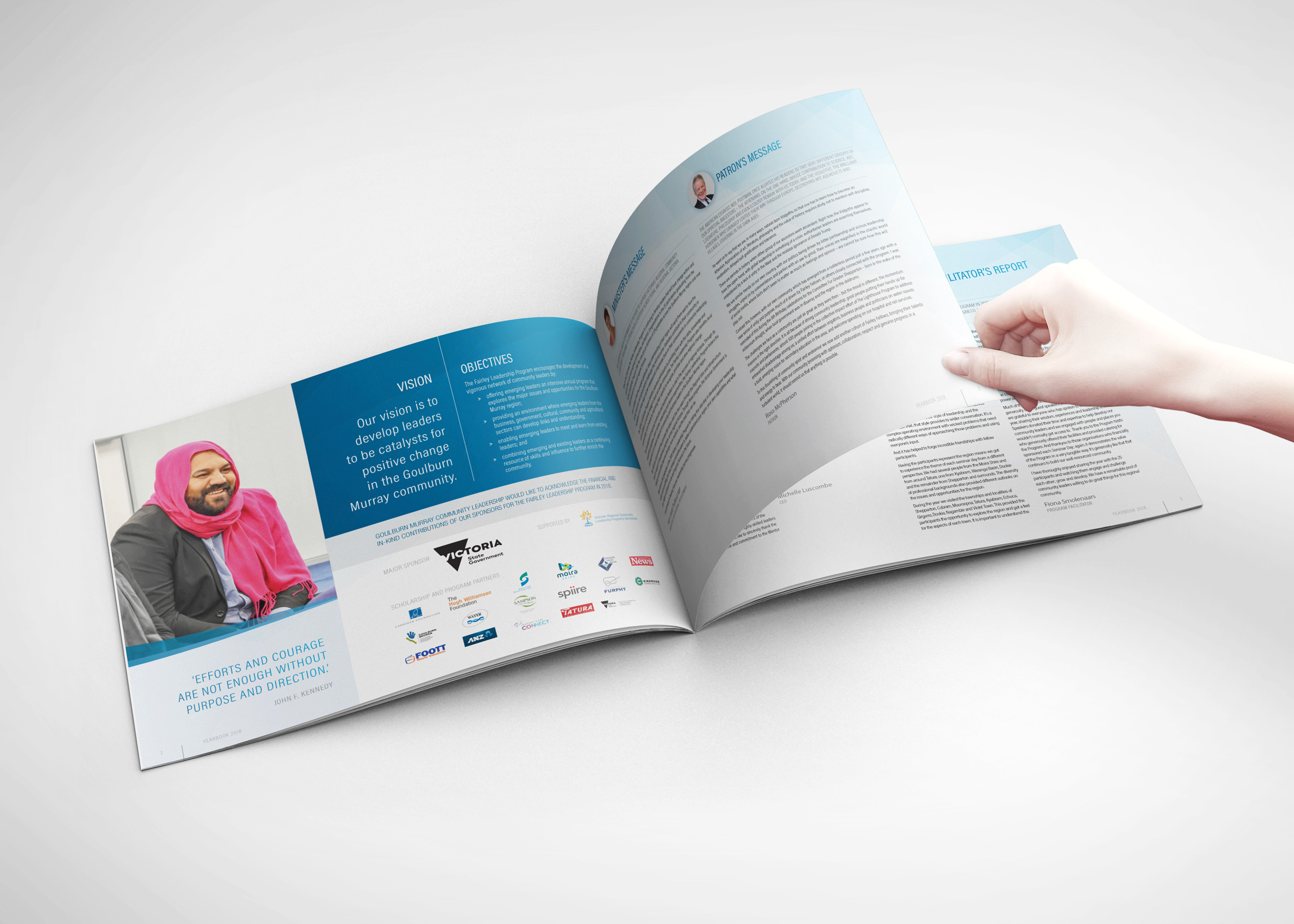
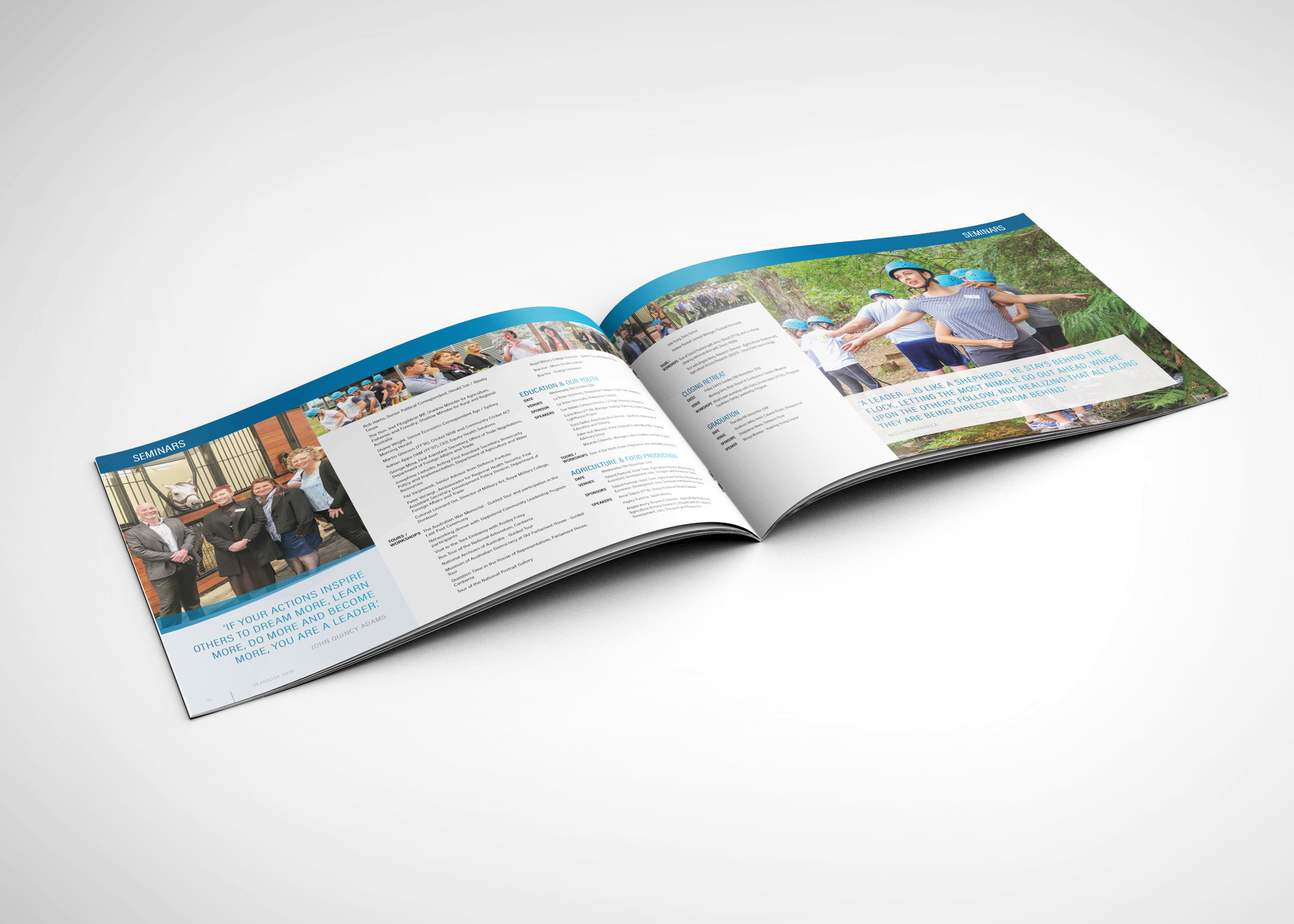
Fairley Leadership Program 2018
Fairley Leadership Program 2018
Design & Print Management – 24pp Yearbook 2018
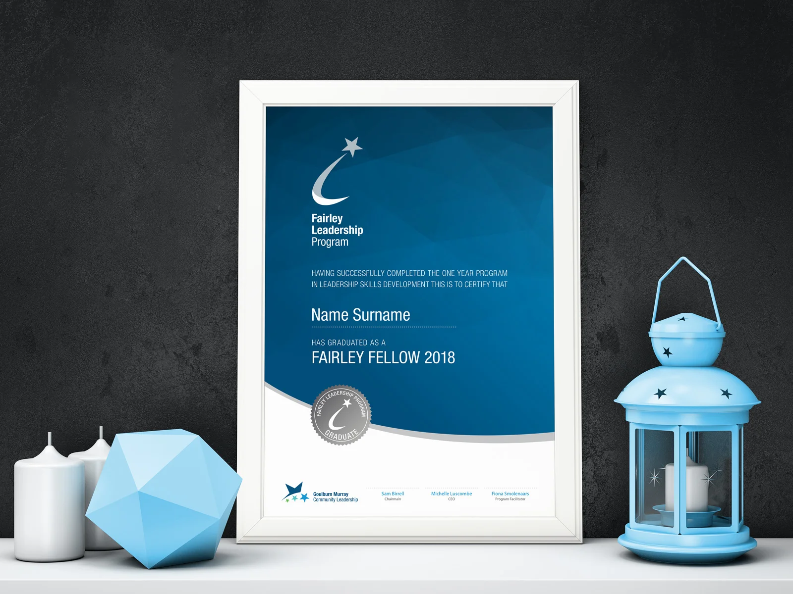
Design – Certificates 2018

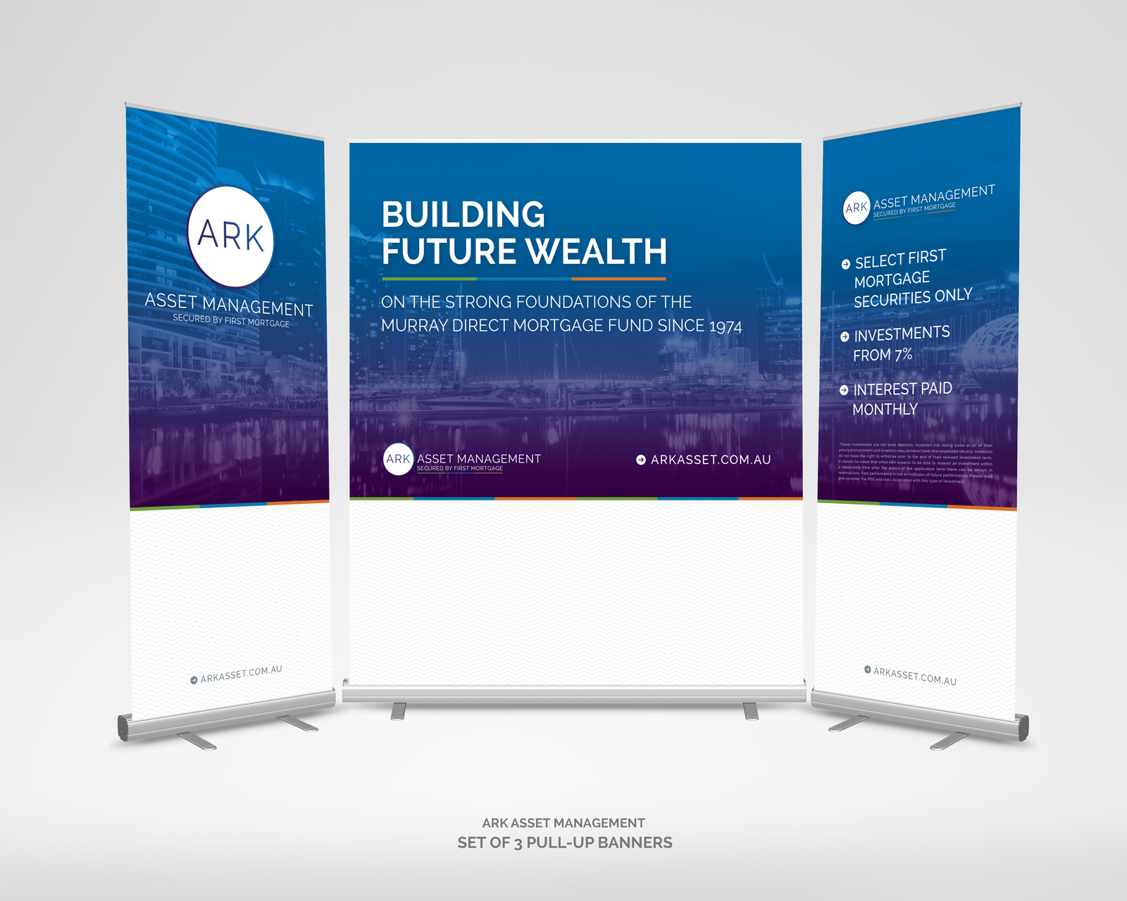
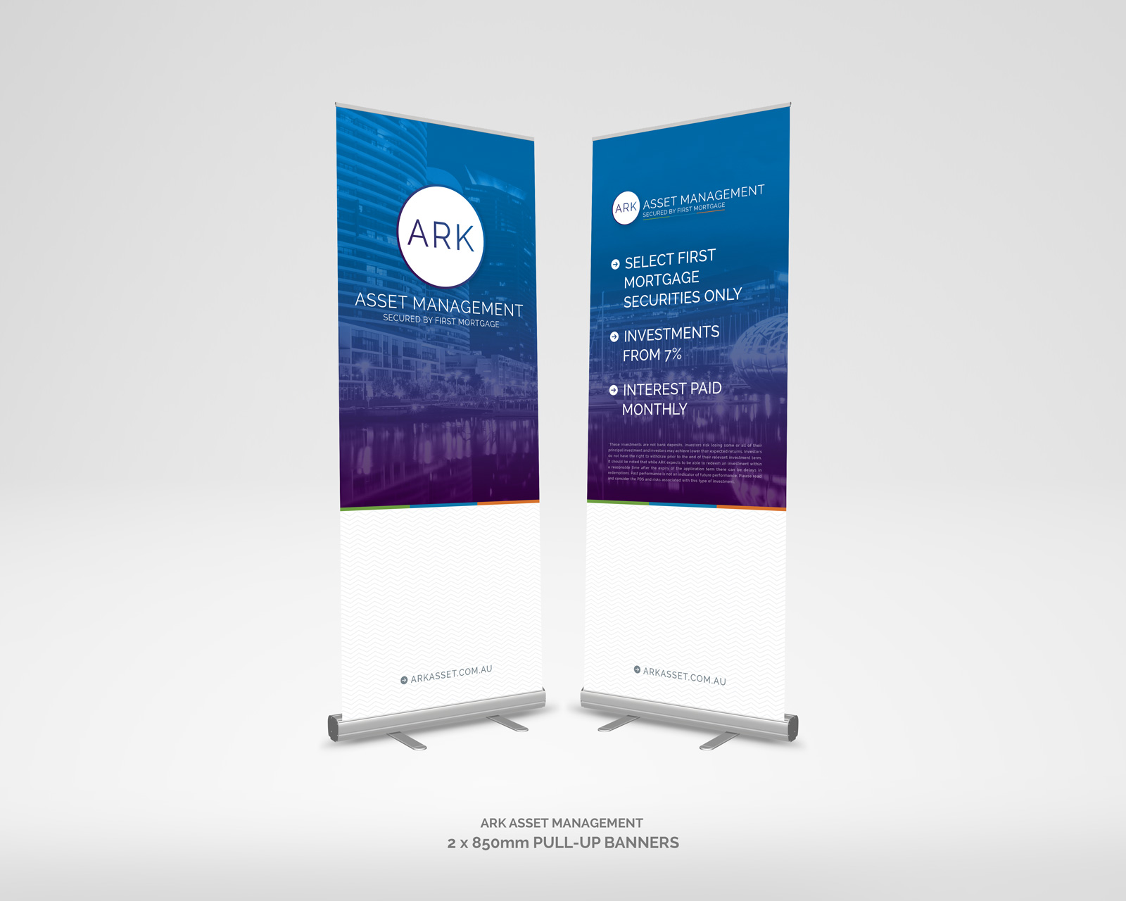
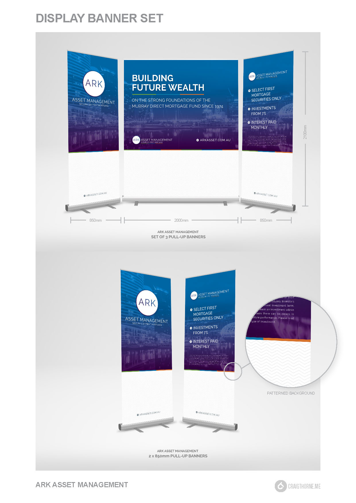
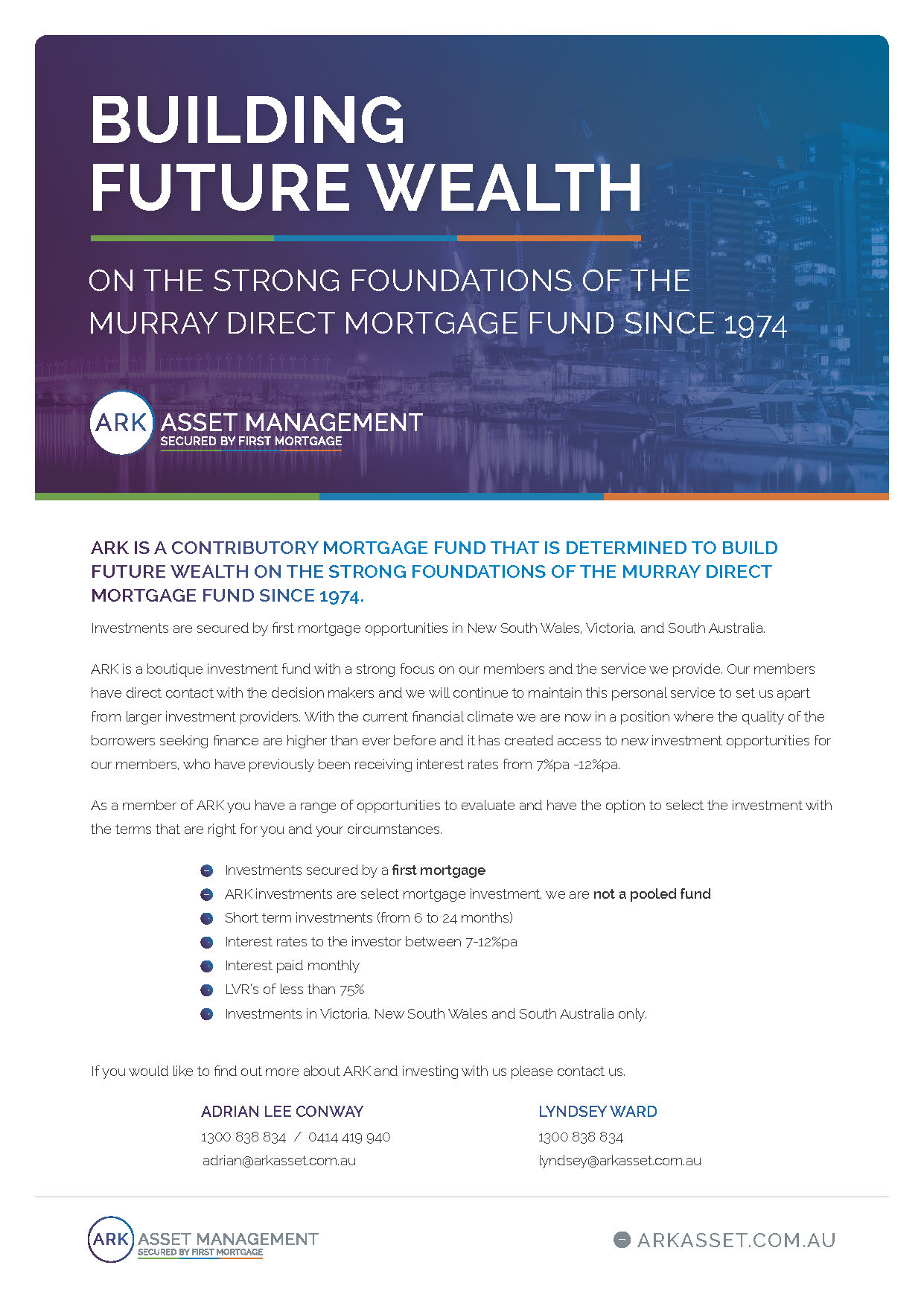
Ark Asset Management Event Display
Ark Asset Management Event Display
Corporate Event Pull-Up Banner Set
Designed to be used as a set of three for large events and a set of 2 for smaller events

Sharcore Constructions
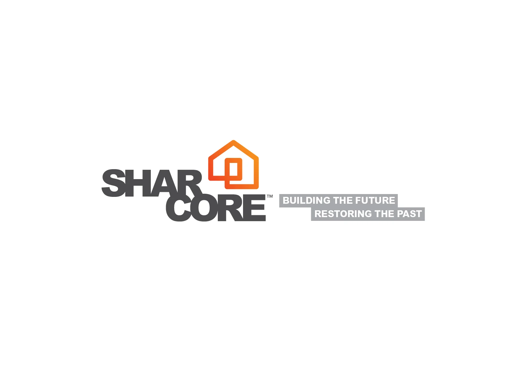
Sharcore Construction - Logo and Brand Design
DESIGN BRIEF
Create an unique brand mark that sets “Sharcore Constructions” apart from their opposition.
New logo design is to be; bold, eye-catching and clearly identifiable from a distance. The design needs to be versatile as vehicle signage must work on both light (White) and dark (Charcoal) coloured vehicles & trailers.
It was suggested to keep existing corporate colours of; Orange, Black/Grey & White although, consideration will be give to other colour options if presented. The design and/or elements of the design need to work as social media icon for consistent branding. EG. Facebook Circular Icon
Consideration to be given to the fact that 'Sharcore' is sometimes referred to as 'Share-Core'.
The Solution
The new, ‘Sharcore Constructions’ logo has been designed to be clean, bold and easily recognisable. Using clean lines and striking colour creates impact. A ‘house’ icon was designed to add a visual element that is easily identifiable. Also splitting the word Sharcore helps readability of the words ‘Shar’ and ‘Core’ hopefully reduce the misinterpretation of ‘Share-care’.
The design is strong, bold and versatile which works well on both light and dark backgrounds.



SHARCORE Website: http://sharcore.com.au/
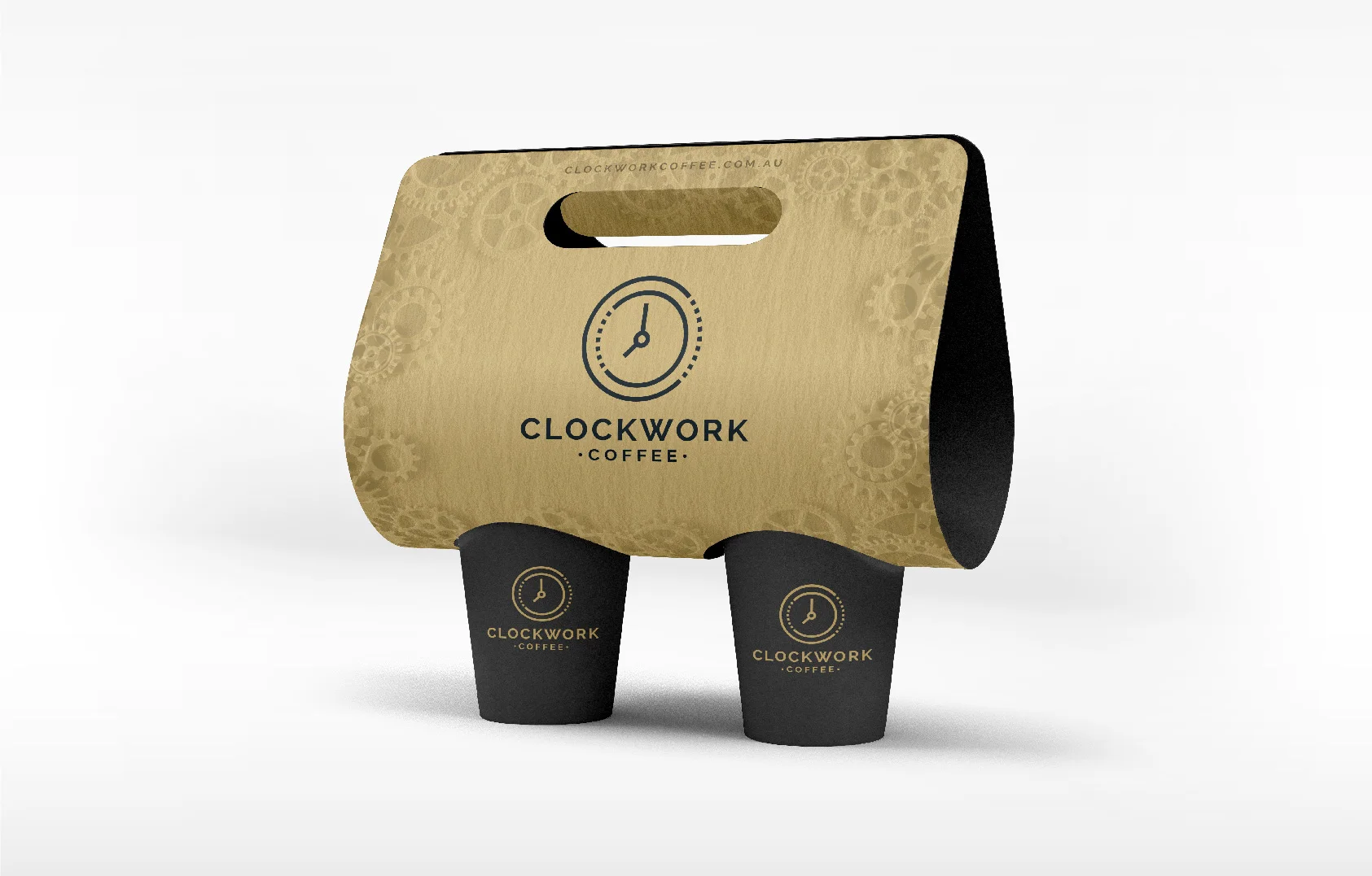
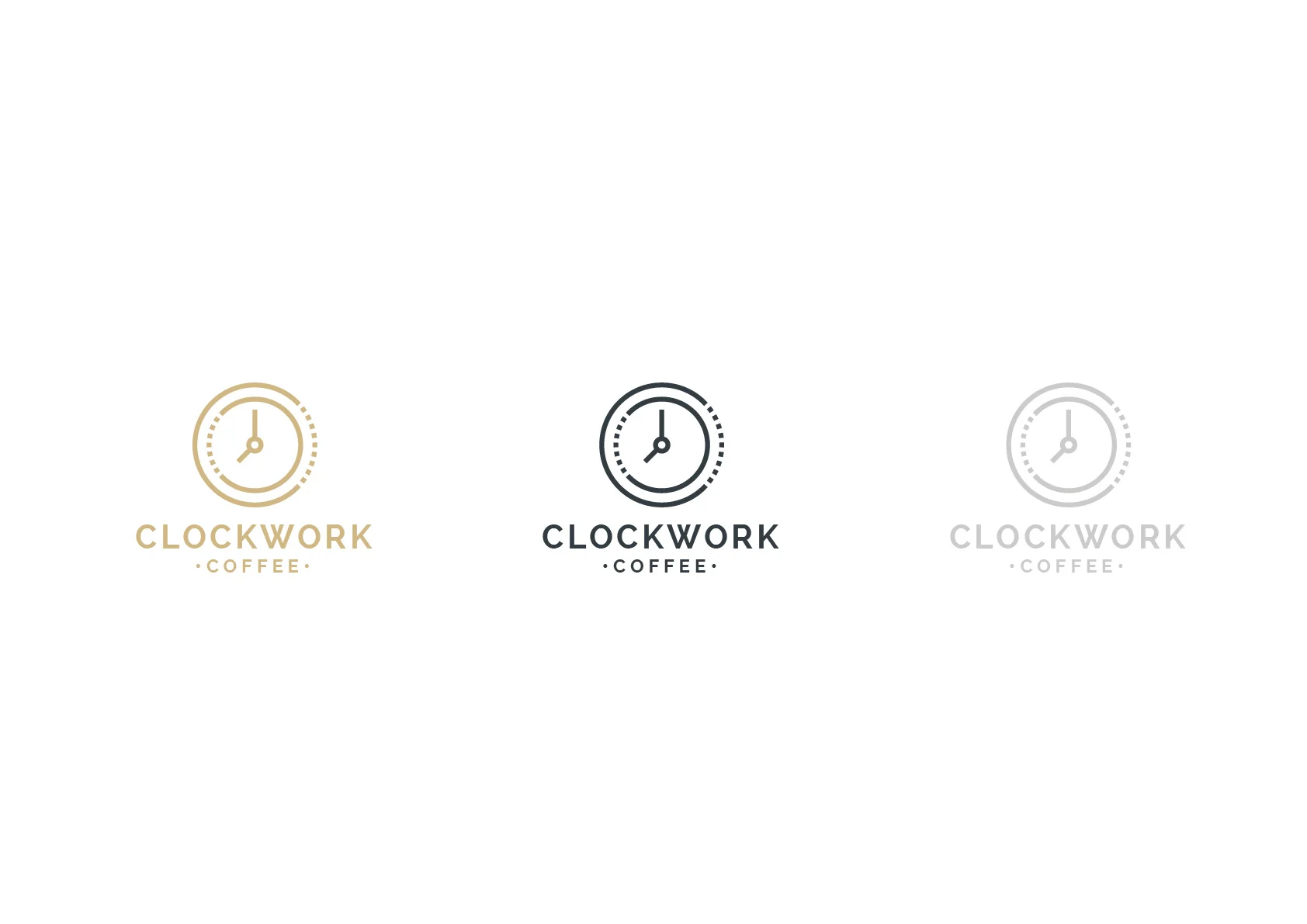
Clockwork Coffee
Clockwork Coffee - Rebrand
Clockwork Coffee Rebrand
– The Brief –
Create an unique brand mark that sets “Clockwork Coffee” apart from their opposition.
The new logo design is to portray a sense of precision. A sense of class and sophistication.
The design needs to be versatile and clearly identifiable when used with light and dark backgrounds. It was important the design and/or elements of the design needs to work on social media for consistent branding.

– THE SOLUTION –
The new Clockwork Coffee logo was designed to be simple using clean lines to form a clock face. Dotted / broken lines have been used to help portray the mechanical ‘workings’ of the clock. i.e. the ‘clockworks’. The design works well at both large and small scale. The clock icon is used on social media networks which helps connect a strong brand awareness.