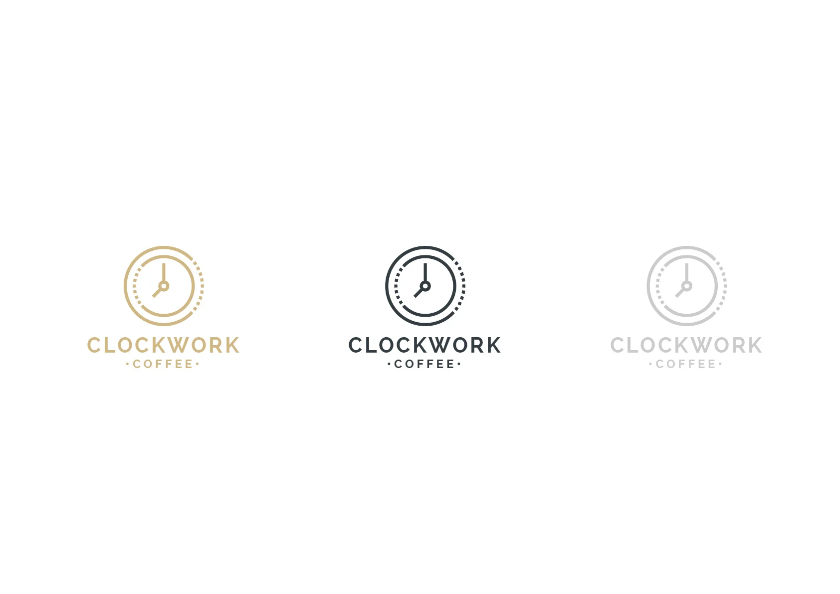
Clockwork Coffee
Clockwork Coffee Rebrand
– The Brief –
Create an unique brand mark that sets “Clockwork Coffee” apart from their opposition.
The new logo design is to portray a sense of precision. A sense of class and sophistication.
The design needs to be versatile and clearly identifiable when used with light and dark backgrounds. It was important the design and/or elements of the design needs to work on social media for consistent branding.
– THE SOLUTION –
The new Clockwork Coffee logo was designed to be simple using clean lines to form a clock face. Dotted / broken lines have been used to help portray the mechanical ‘workings’ of the clock. i.e. the ‘clockworks’. The design works well at both large and small scale. The clock icon is used on social media networks which helps connect a strong brand awareness.


