Shepp Show Branding
In 2015, the Shepparton Agricultural Society wanted to rejuvenate their annual show with a focus on bringing back more agricultural for families to enjoy...
In 2015, the Shepparton Agricultural Society wanted to rejuvenate their annual show with a focus on bringing back more agricultural for families to enjoy. The goal was to provide a family friendly atmosphere with hands-on displays showcasing local food, agriculture and entertainment.
– THE BRIEF –
I was asked to develop a new identity for the 'Shepparton Agricultural Show' that was fun, energetic and represents the region's agriculture industry.
– The solution –
The new logo was designed to be cheerful and inviting with a focus on engaging with families. A cheerful cow mascot was designed to add personality that also links to the region's agricultural industry. In my research I found that most people referred to the show as simply 'Shepp Show'. It was decided to run with this keeping the name short and punchy.
A 'name the mascot' competition was held to promote the new brand and generate interest in the upcoming show. It was a great success and the new name was chosen...
'Maisie Moo'
Above is a food manufactures application form.
2015 event program cover.
2015 Showgrounds Event Map [click to enlarge]
Sample merchandise.
Display flags were used to promote the show in the weeks prior.


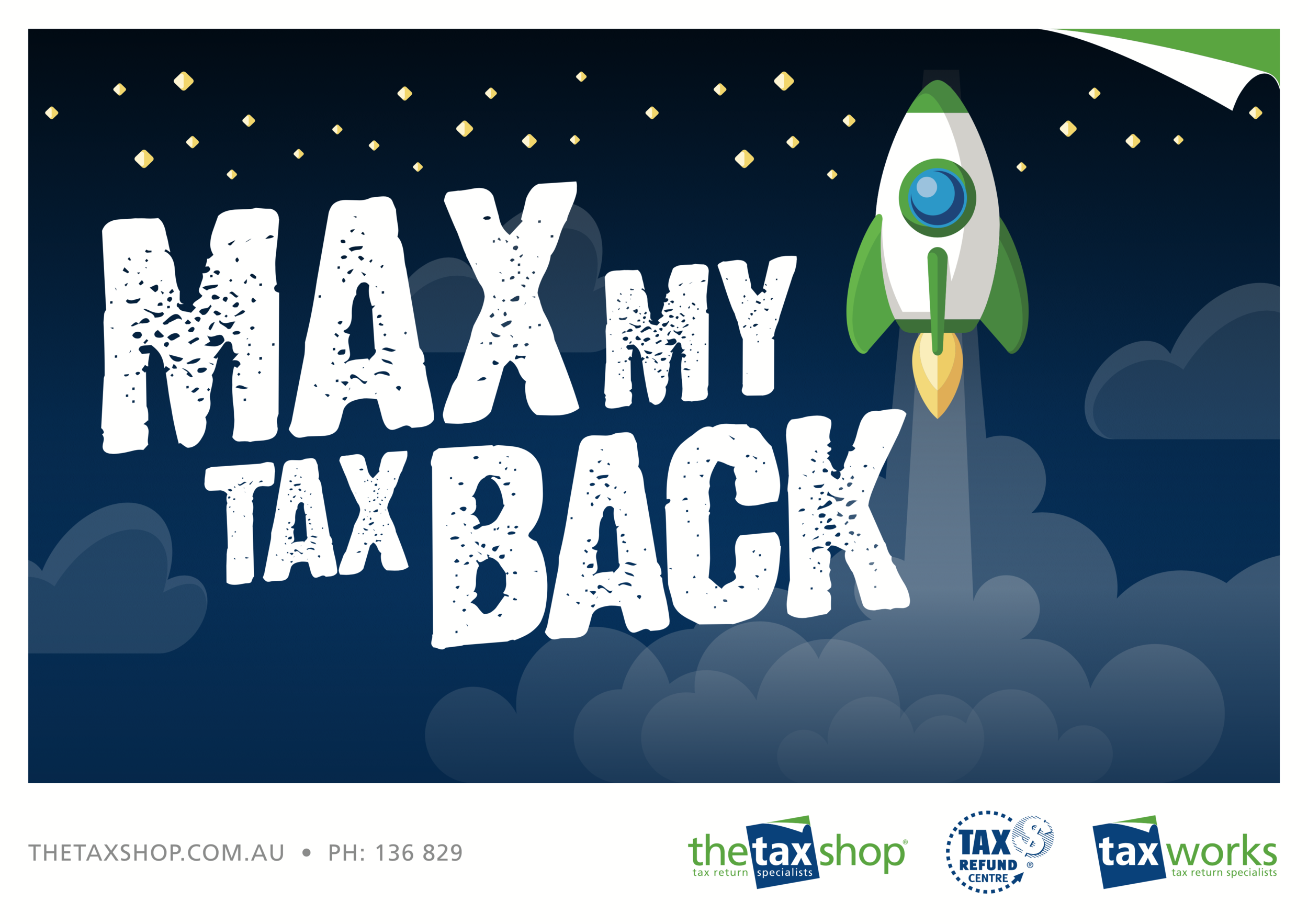
The Tax Shop
Brand & Marketing for The Tax Shop Australia.
With 19 location around Australia, TheTaxShop annually provide fast taxation services to over 25,000 clients.
Brand & Marketing for The Tax Shop Australia.
The Tax Shop started in Shepparton Victoria and has grown to offer 18 locations throughout Australia and currently 1 office in London, UK. TheTaxShop provides fast taxation services to over 25,000 clients annually.
Craig Thorne ~ DesignCreative™ works closely with The Tax Shop Australia and developed their logo and brand assets, office signage and shopping centre ‘Pop-Up’ booths, social media and marketing.
SOCIAL MEDIA : National Social Media Campaigns


SIGNAGE : New signage designed for The Tax Shop Offices & ‘Pop-up’ Sites


PRINT : Poster and DL Brochures


WEBSITE : Landing Page for Early Tax Return Campaign

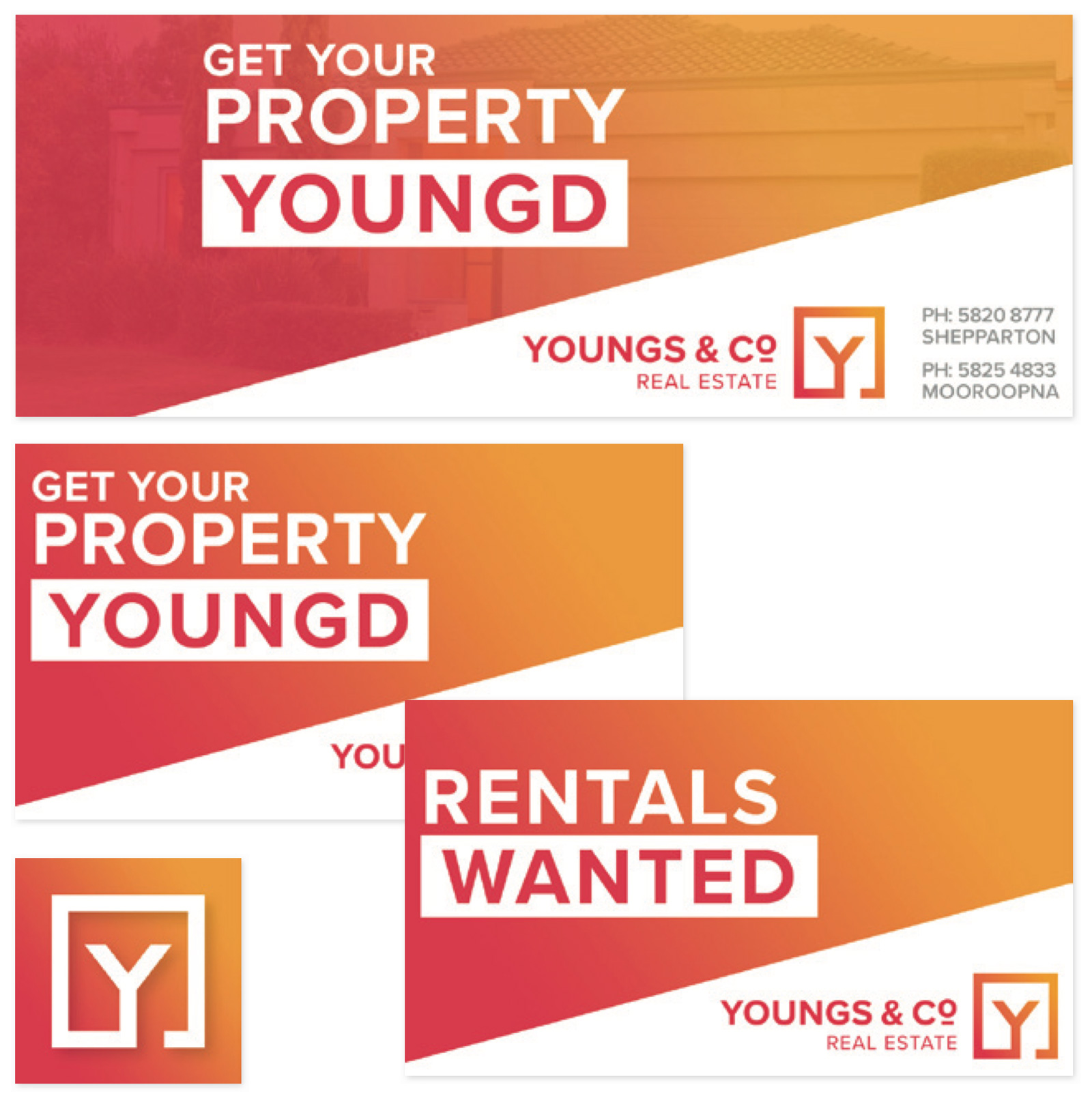
Youngs & Co Real Estate
Youngs & Co Real Estate agency approached me to develop a new brand for them. They wanted something fresh, modern and have maximum impact on their signage.
Youngs & Co Re-Brand
Youngs & Co Real Estate agency approached me to develop a new brand for them. They wanted something fresh, modern and have maximum impact on their signage.


Kialla Lakes Estate
Kialla Lakes Sub-Division Stage 35a & 35B plan artwork
Sub-division plan artwork and promotional press-ad for Kialla Lakes Estate
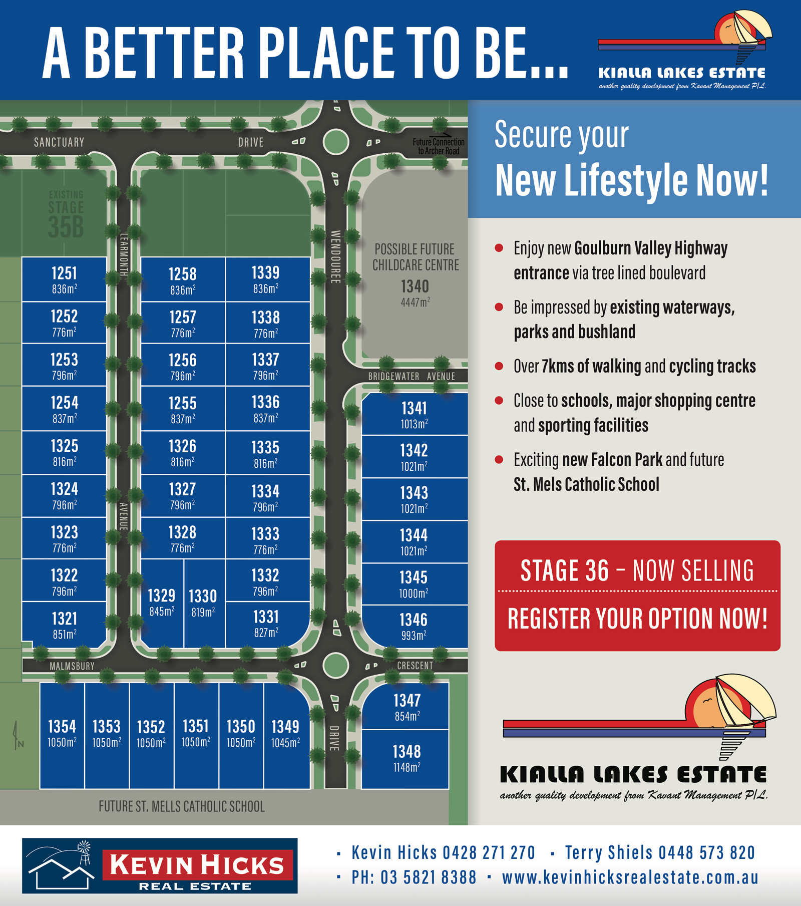
STAGE 36 - Press Ad
STAGE 35a & 35b Press Ad

Prepare Like A Pro
Prepare Like A Pro Event Brand & Promotional Design
Prepare Like A Pro Event
Brand & Promotional Design
Promotional Poster
Website Landing Page
Social Media Graphic
Social Media Graphic
School Competition Poster
Promotional Banner

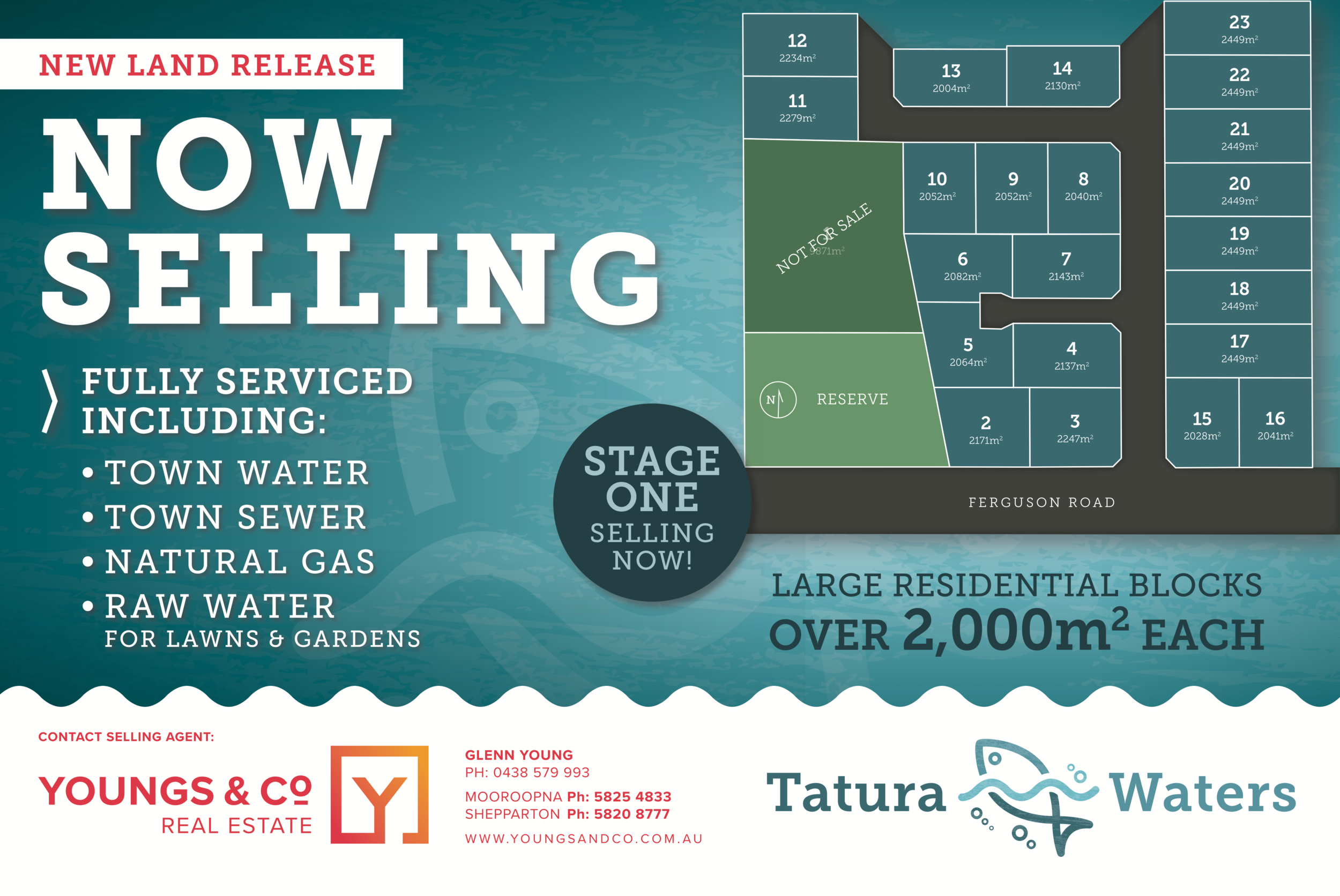
TaturaWaters
TauraWaters is a new land development on the eastern side of Tatura, Victoria. I was approached to design a new logo that gives reference to the development's planned water ways/lagoons which will be stocked with fish.
TaturaWaters - Branding and Visual Presentation Design
TauraWaters is a new land development on the eastern side of Tatura, Victoria. I was approached to design a new logo that gives reference to the development's planned water ways/lagoons which will be stocked with fish.


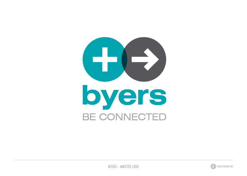
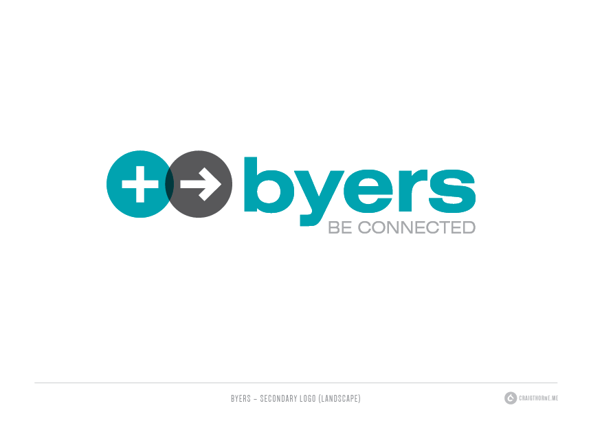
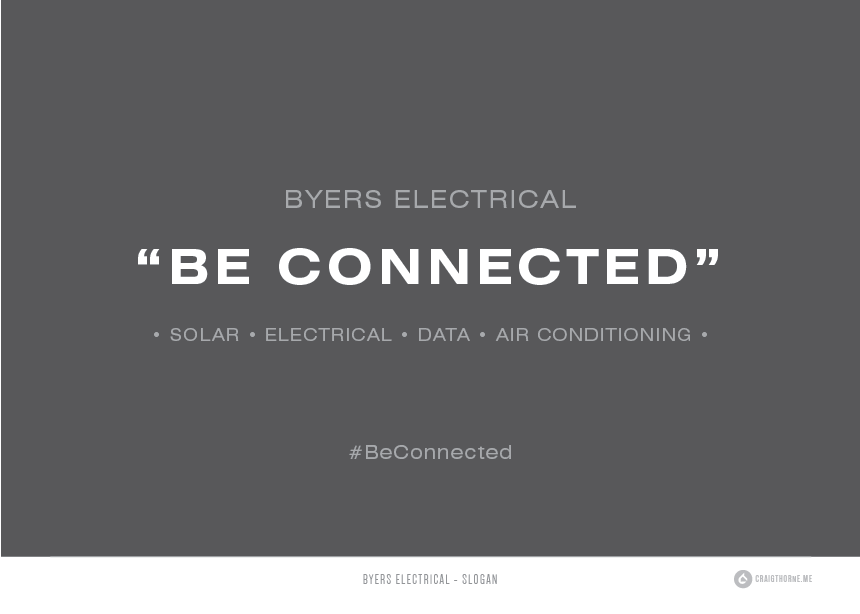
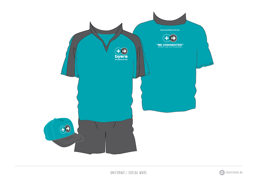
Byers Electrical Rebrand
Byers Electrical is a family electrical contracting business based in Shepparton and Bendigo. They provide solar, electrical, data and air conditioning services.
Byers Electrical is a family electrical contracting business based in Shepparton and Bendigo. They provide solar, electrical, data and air conditioning services.
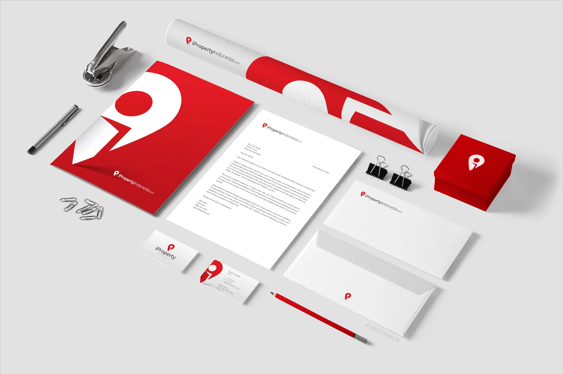
iProperty Indonesia
I was requested to develop branding for a new Indonesian Real Estate business called 'iProperty Indonesia'.
I was requested to develop branding for a new Indonesian Real Estate business called 'iProperty Indonesia'.
Indonesia is a very popular tourist destination located between North West Australia and South East Asia and has a population of around 255 Million.
– The DESIGN brief –
The client wanted a fresh, modern design that would appeal to property buyers located outside of Indonesia.
– THE SOLUTION –
I developed a logo that resembles a map location pin that incorporates an opening door giving the design a homely / dwelling feel. The negative space of the door and circular pin creates the letter 'i' for 'iProperty'. The result in bringing these elements together creates a unique, easily recognisable icon. Red was chosen for it's boldness and strength and is also used in the Indonesian flag.


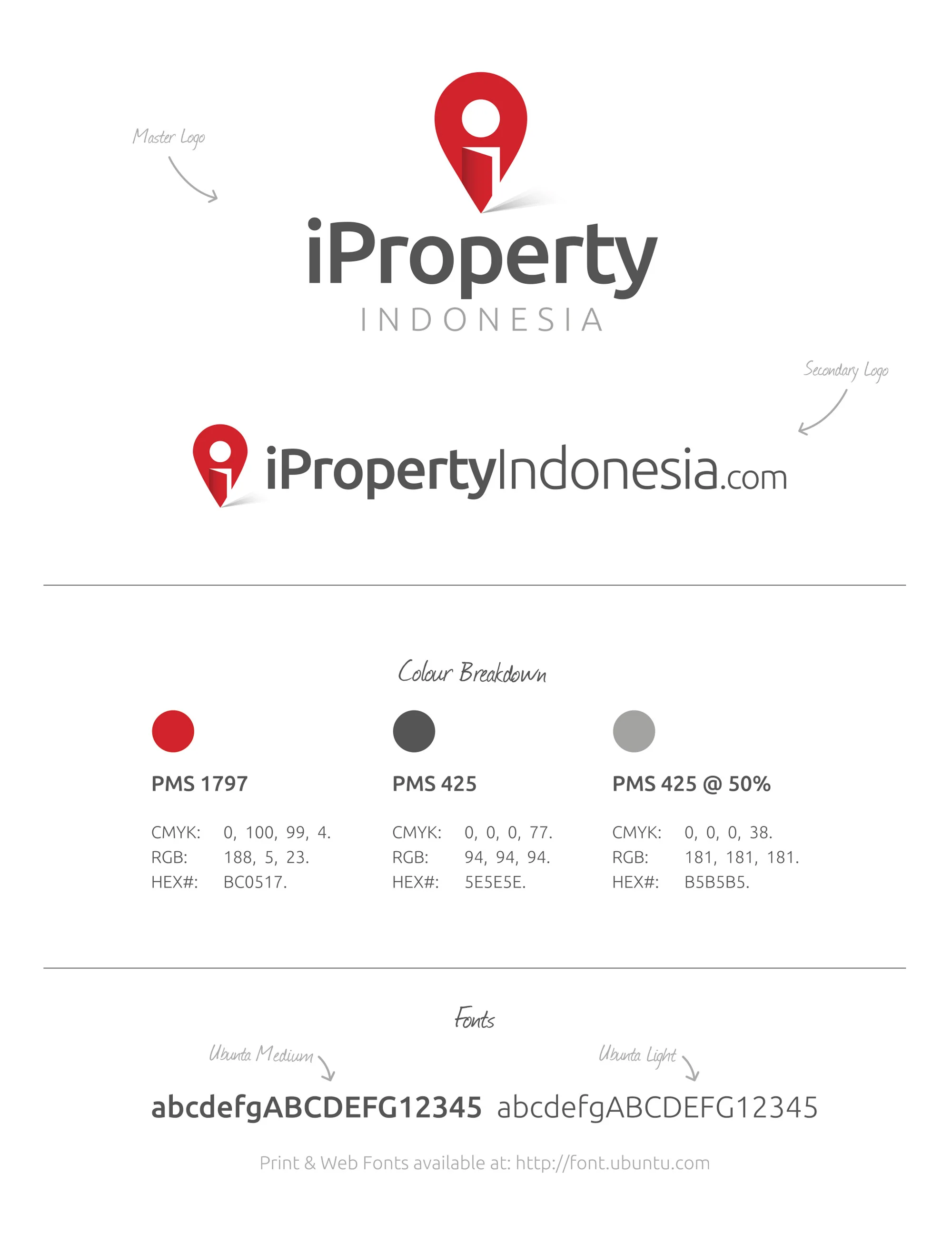
Designed by: Craig Thorne

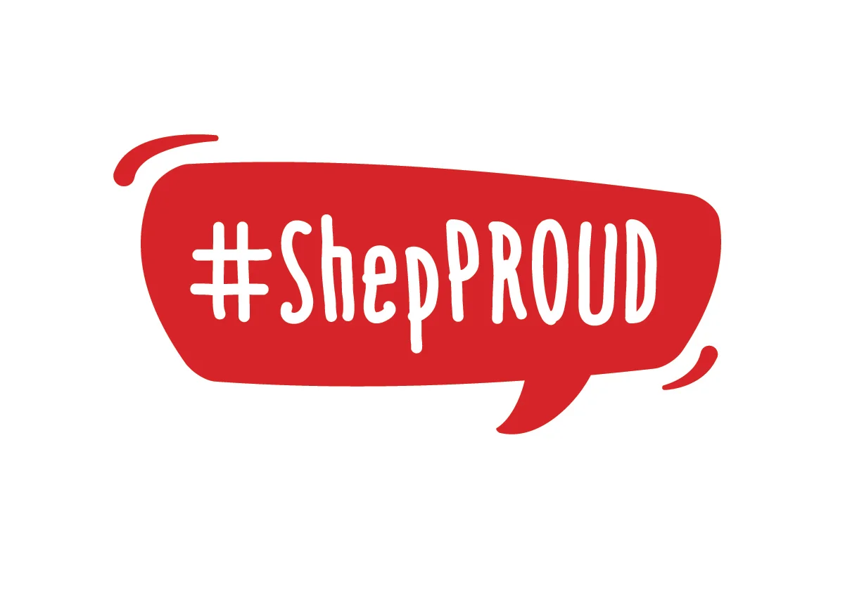
#ShepPROUD Logo & Marketing Design
#ShepPROUD Logo & Marketing Design
The concept behind the #ShepPROUD initiative is to give 15-25 year olds a voice to speak about the benefits and positive opportunities Sepparton has to offer.
#ShepPROUD Logo & Marketing Design
The concept behind the #ShepPROUD initiative is to give 15-25 year olds a voice to speak about the benefits and positive opportunities Sepparton has to offer.
– The Solution –
The #ShepPROUD logo has been designed to be positive and energetic with a focus on engaging 15-25 year olds.
The bouncy, playful nature of the design adds personality and by incorporating the 'speach bubble' in the design helps illustrate a voice in the community.
The design is versatile and can be easily applied to all forms of media for marketing/promotion.
~ Logo and marketing design by Craig Thorne


Waverley Park Estate
Waverley Park Estate is new land development located in Merrigum, Victoria. I was asked to create a unique brand and communication material.
Waverley Park Estate is new land development located in Merrigum, Victoria. I was asked to create a unique brand and communication material.


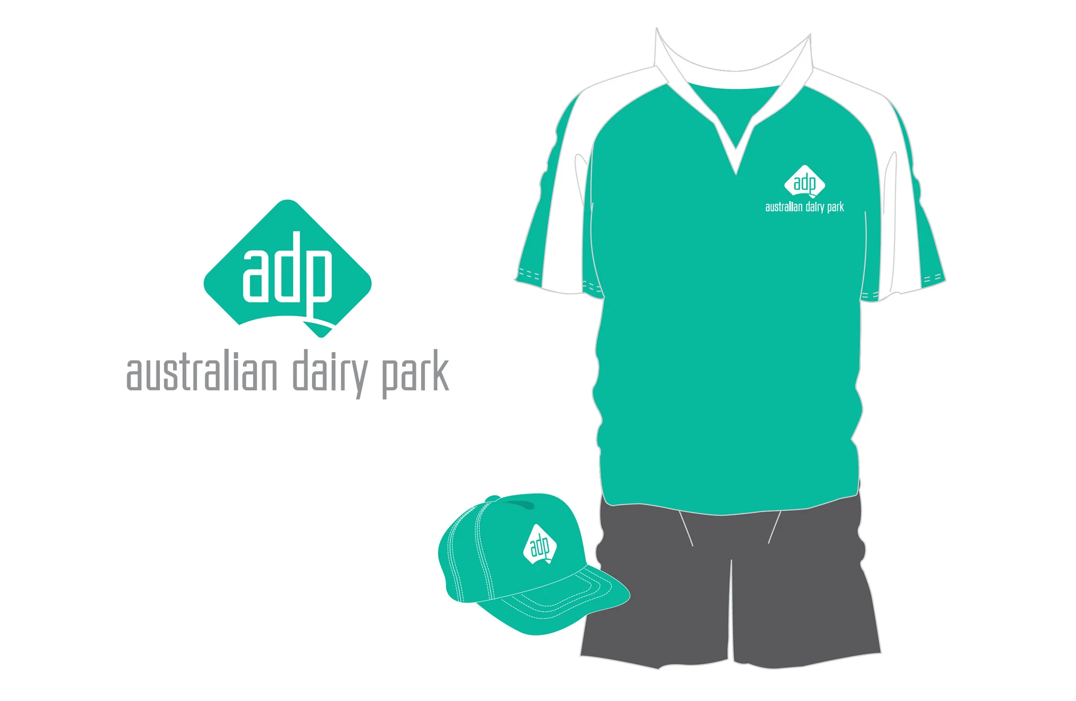
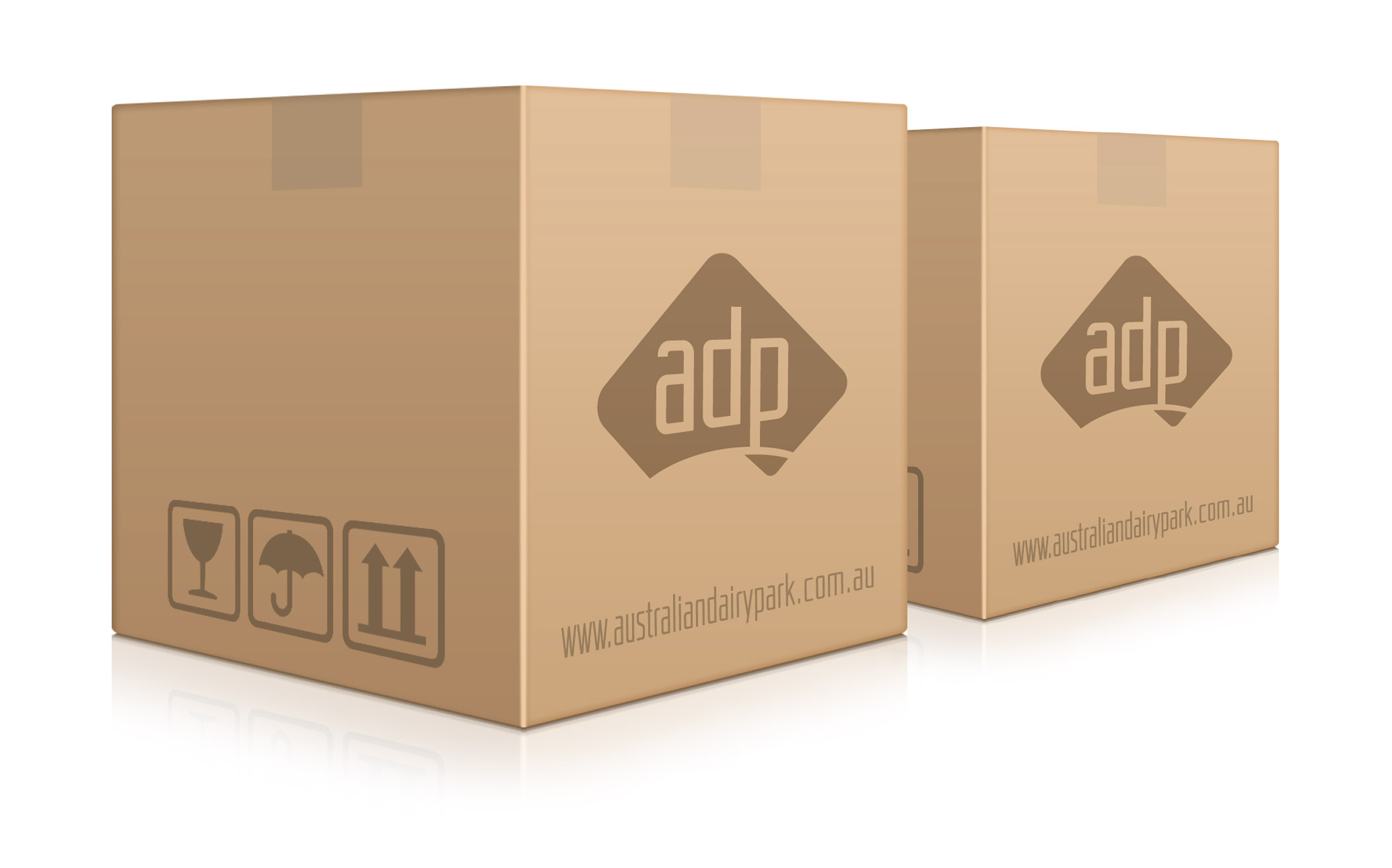
Australian Dairy Park
Australian Dairy Park is a large-scale enterprise processing and packing facility. Specialising in the manufacture and packaging of milk powder products for Australian and Chinese markets.
Australian Dairy Park Branding
Australian Dairy Park is a large-scale enterprise processing and packing facility. Specialising in the manufacture and packaging of milk powder products for Australian and Chinese markets. Production capacity is more than 20,000 tons per annum.
– THE BRIEF –
Australian Dairy Park required a strong, easily identifiable brand that sets them apart from their competitors in the crowded powdered milk industry.
– THE SOLUTION –
I develop a simplified diamond shaped map of Australia to help illustrate the company's location. Australian milk product are highly regarded throughout international markets for it premium grade quality. Green was chosen to represent the lush Australian farmland from where the milk is collected

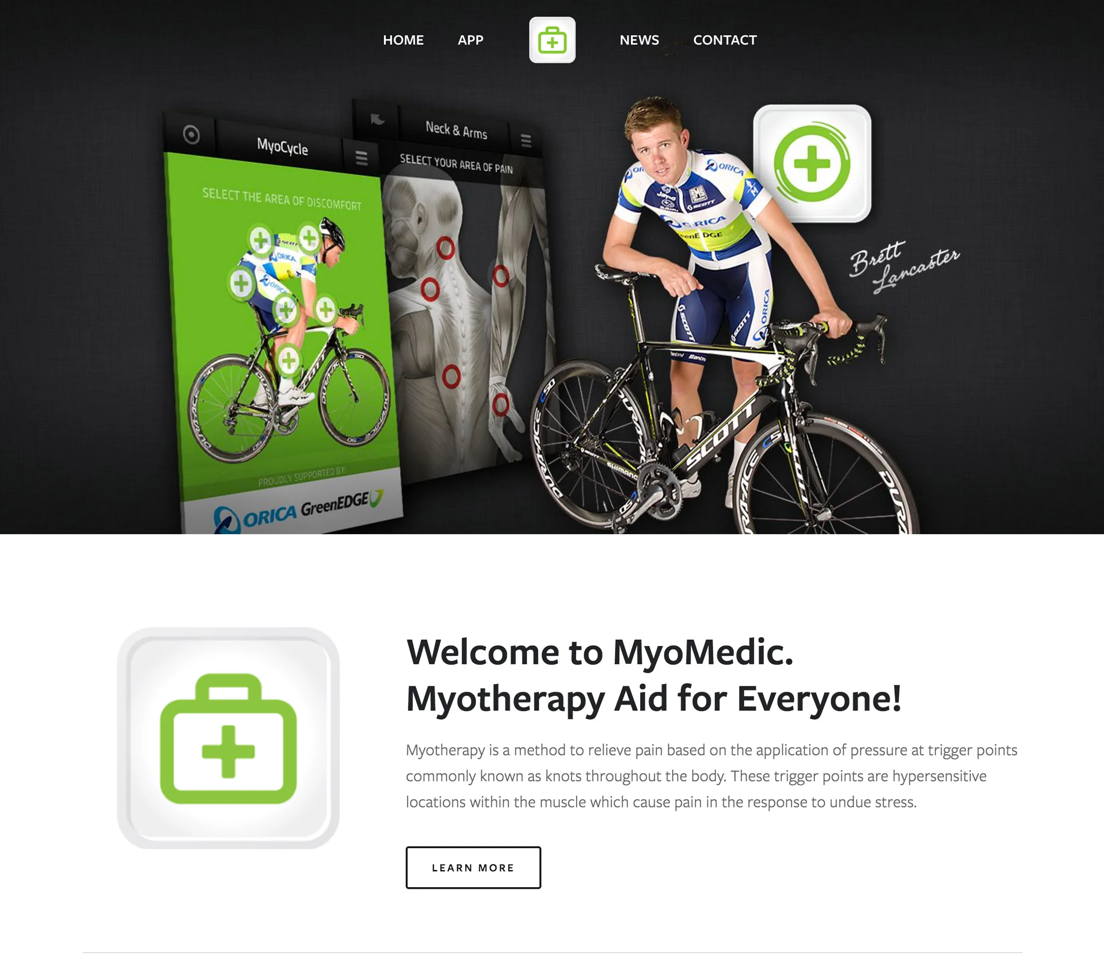
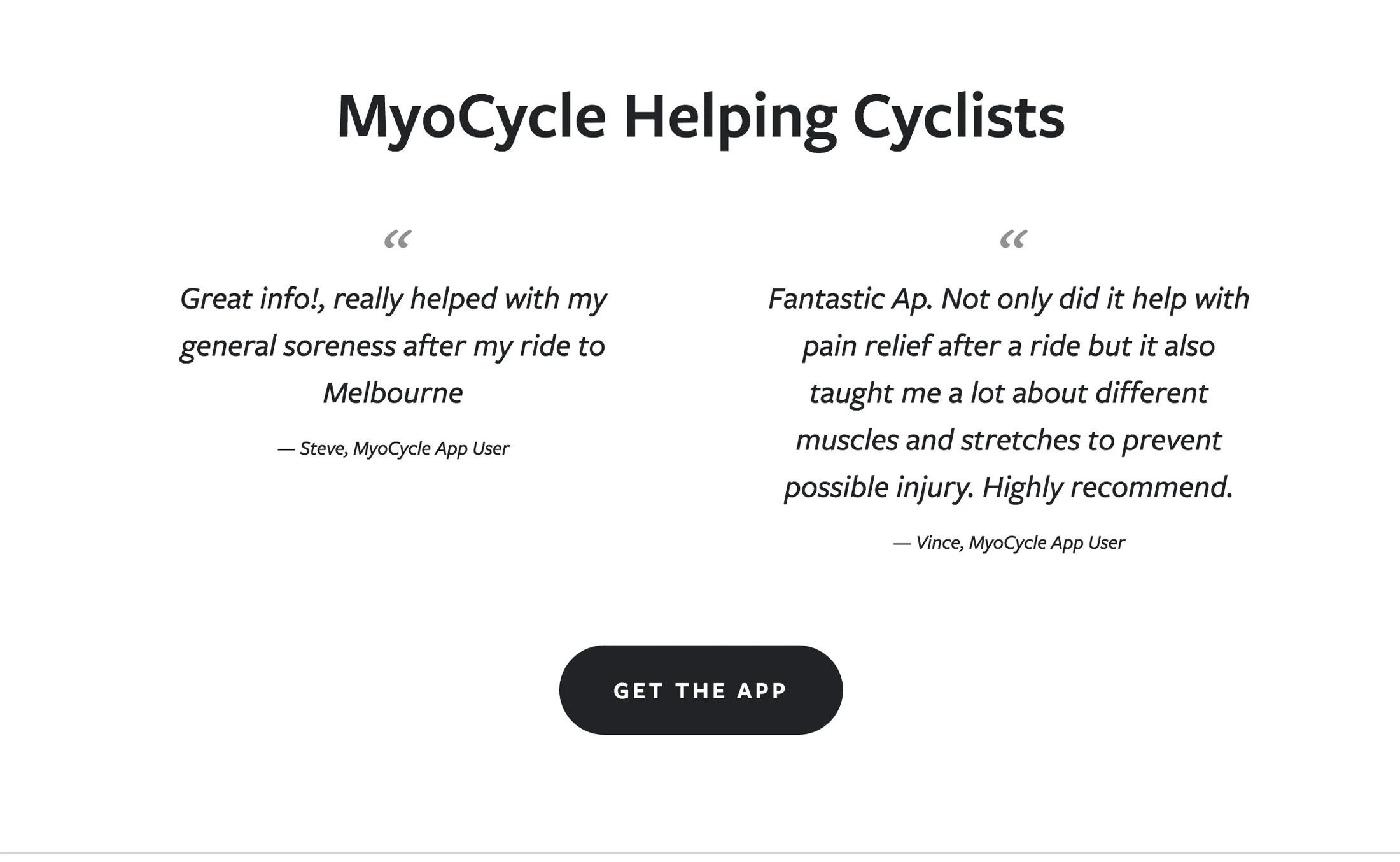
MyoCycle
MyoCycle is an interactive tool that gives cyclists the opportunity to educate themselves about common cycling related injuries, how to prevent them through strengthening exercises and positioning and how to treat them through corrective exercises.
MyoCycle
Myotherapy Aid for Cyclist
MyoCycle is an interactive tool that gives cyclists the opportunity to educate themselves about common cycling related injuries, how to prevent them through strengthening exercises and positioning and how to treat them through corrective exercises.
Myocycle is designed by experienced professionals for cyclists of all levels. Whether you are a social rider, weekend warrior or an elite professional, you will have suffered pain through injury or strain.
Myotherapy provides an accurate assessment of the typical causes of pain and offers specifically targeted techniques for both prevention and relief.
~ MyoCycle Branding, Phone Apps & Website designed by Craig Throne


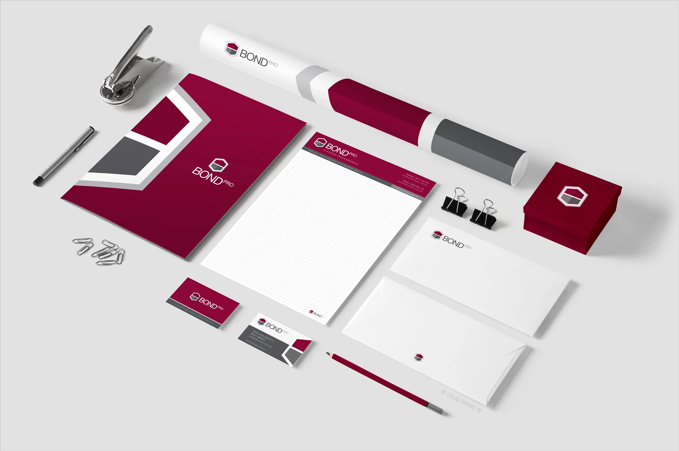
BondPro Rebranding
BondPro are specialists in the supply and installation of aluminium composite panels for small bungalows to as large as a warehouse.
– BondPro Rebranding –
BondPro are specialists in the supply and installation of aluminium composite panels for small bungalows to as large as a warehouse.
– THE BRIEF –
BondPro wanted to re-energise their brand with an updated look. The brief was to create a new logo that could boldly represent the external cladding systems they install on the outside of buildings. The client also requested that the new design needed to continue to use their corporate colours as they had heavily invested in incorporating these colour throughout their business.
– The Solution –
I developed a simple logo that illustrates a corner of a newly clad building. The logo was produced in vertical and landscape options, both in colour and reversed (white) as well. Used consistently across their range of stationery creates a strong, bold brand presence that stands out against their competitors.
– THE OLD BondPro Logo –

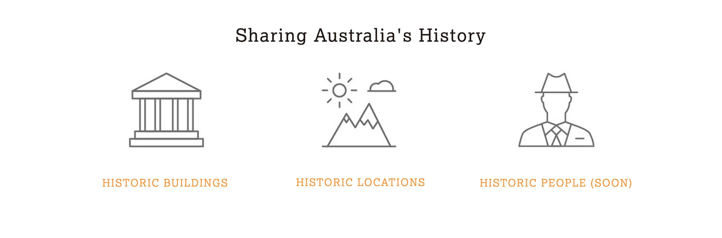
History Hunters
History Hunters is a group of mates with a passion for photography and telling stories of forgotten buildings, historic landscapes and memorable characters.
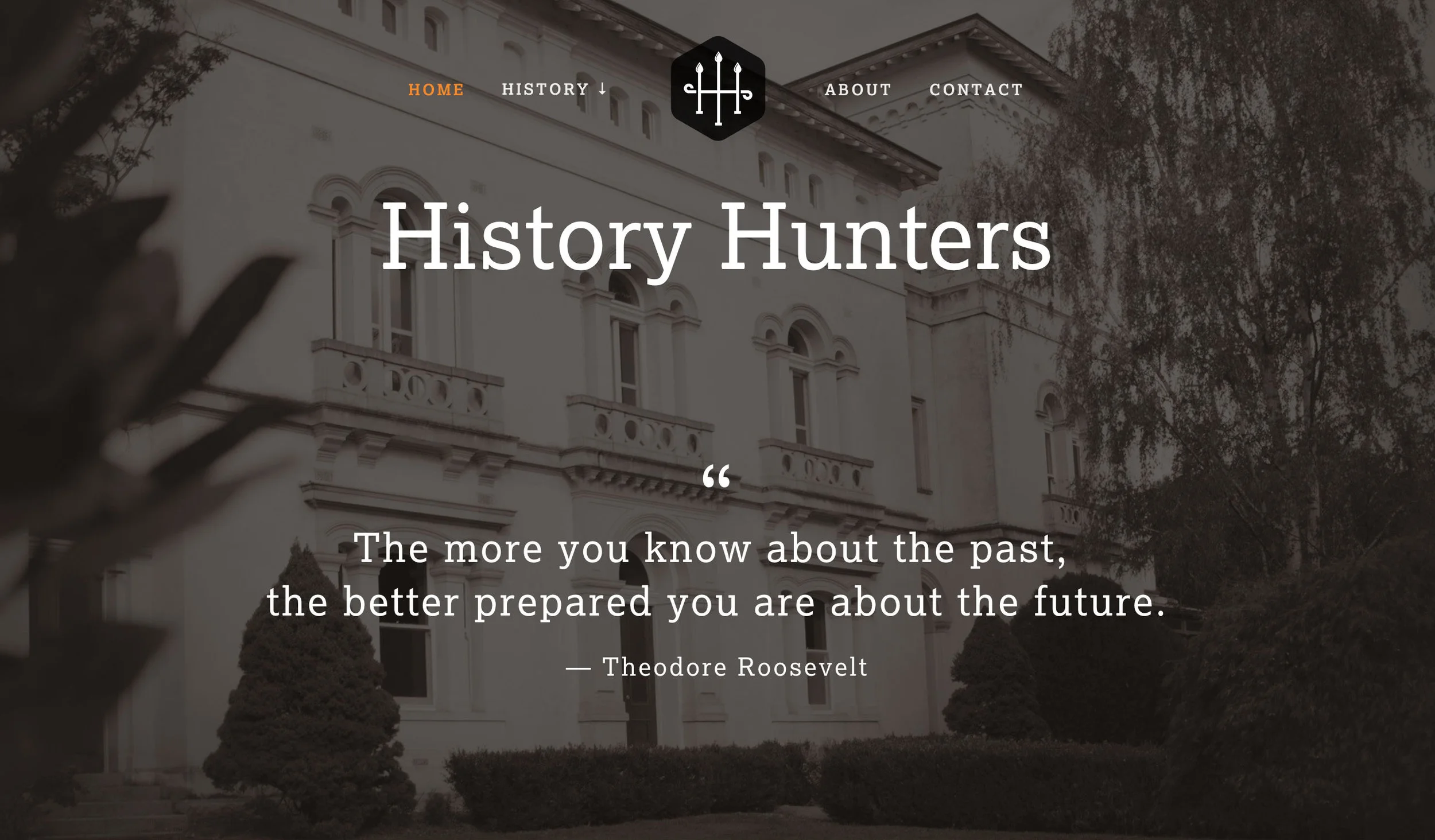
– The Brief –
The brief was to create a memorable brand with a historic connection. A symbol of 2 connected 'H's was developed in a style of traditional forged iron bars typically found on fences of period homes. Once the logo was finalised, branding continued to be developed in print stationery, social media content through to website. It was important to keep the styling consistent across all forms of communication.
– ABOUT HISTORY HUNTERS –
History Hunters is a group of mates with a passion for photography and telling stories of forgotten buildings, historic landscapes and memorable characters.
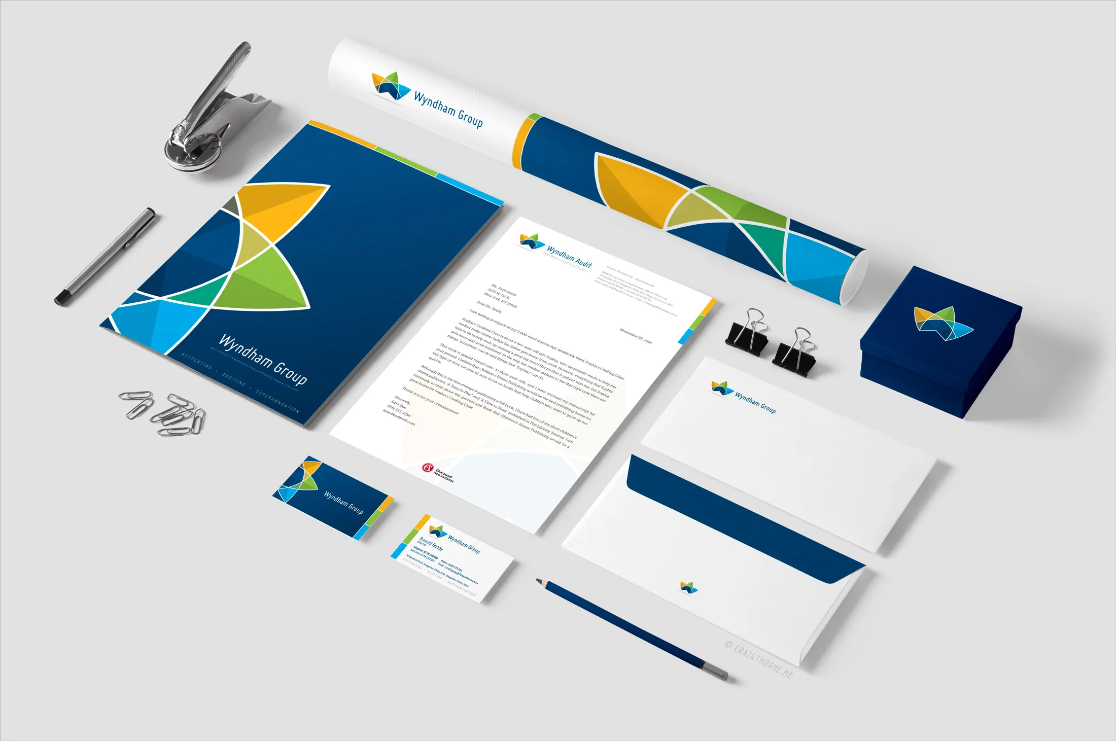
Wyndham Group Branding
Wyndham Group is a accountancy firm based in Shepparton which is located in the Goulburn Valley region.
Wyndham Group is a accountancy firm based in Shepparton which is located in the Goulburn Valley region.

Shepparton Camera Club Brand Design
Shepparton Camera Club is a small group who meet monthly to share their passion for photography.
Shepparton Camera Club is a small group who meet monthly to share their passion for photography.


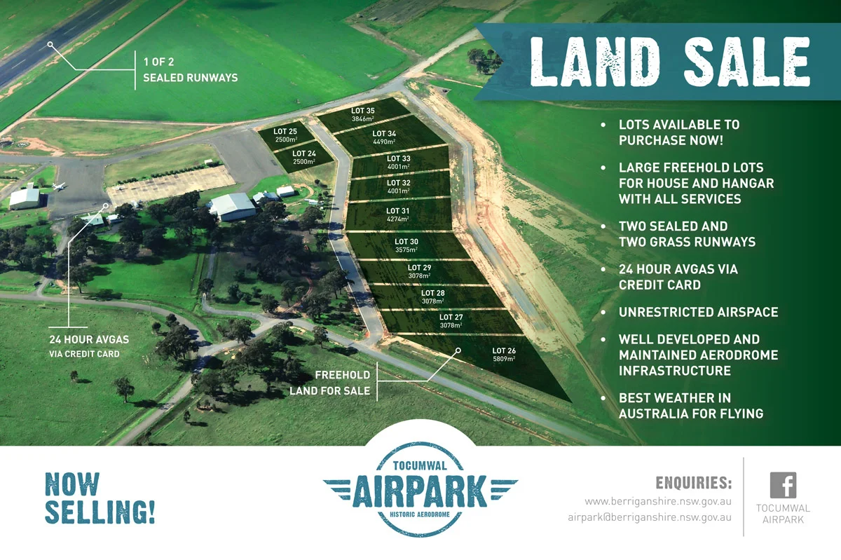
Tocumwal AirPark
The Tocumwal Historic Aerodrome in conjunction with the Berrigan Shire wanted to promote a new land development based at the historic airfield at Tocumwal.
Tocumwal AirPark Brand and Marketing
The Tocumwal Historic Aerodrome in conjunction with the Berrigan Shire wanted to promote a new land development based at the historic airfield at Tocumwal. The development provided an unique opportunity for aviation enthusiasts to purchase a large residential building site capable of housing an aircraft hanger with runway access.
– BRANDMARK –
A brandmark (logo) was developed that reflects the heritage of the airfield site. It was important the logo was easily recognisable and versatile as it was to be used across all forms of media, i.e. signage, press ads, web & TV.
– SIGNAGE –
It was important to show the easy accessibility to the airfield and it's services. A large 3.6m x 2.4m billboard was designed highlighting the airfield's runway & Avgas facilities. The Billboard was erected on the main entry to the development site.
NOTE: Within six months stage 2 had almost sold out.
– PRESS ADS –
Press ads were created for national aviation magazines and rural based newspapers to promote the land sale.
– BRAND ASSETS –
Additional branding assets were created to provide a consistent look across all marketing.
Tocumwal AirPark brand and marketing material designed by Craig Thorne © 2014

Pusen Branding
New branding for Pusen Medical, suppliers of precision medical equipment accross the world.
Pusen Medical supplies precision medical equipment to many countries across the world.
– THE BRIEF –
Pusen Medical required a brand that reflected their high end precision equipment. The brand needed to be clean, modern and invoke a sense of trust. It was important the brand worked at different sizes as it may be used on very small pieces of equipment.
– THE SOLUTION –
I develop a clean typeface that is set on a symmetrical grid. The use of thin lines allows the logo to be sized quite small and is still very readable. Using symmetry in the design helps convey a sense of precision that reflects the company's high standards.


