iProperty Indonesia
I was requested to develop branding for a new Indonesian Real Estate business called 'iProperty Indonesia'.
Indonesia is a very popular tourist destination located between North West Australia and South East Asia and has a population of around 255 Million.
– The DESIGN brief –
The client wanted a fresh, modern design that would appeal to property buyers located outside of Indonesia.
– THE SOLUTION –
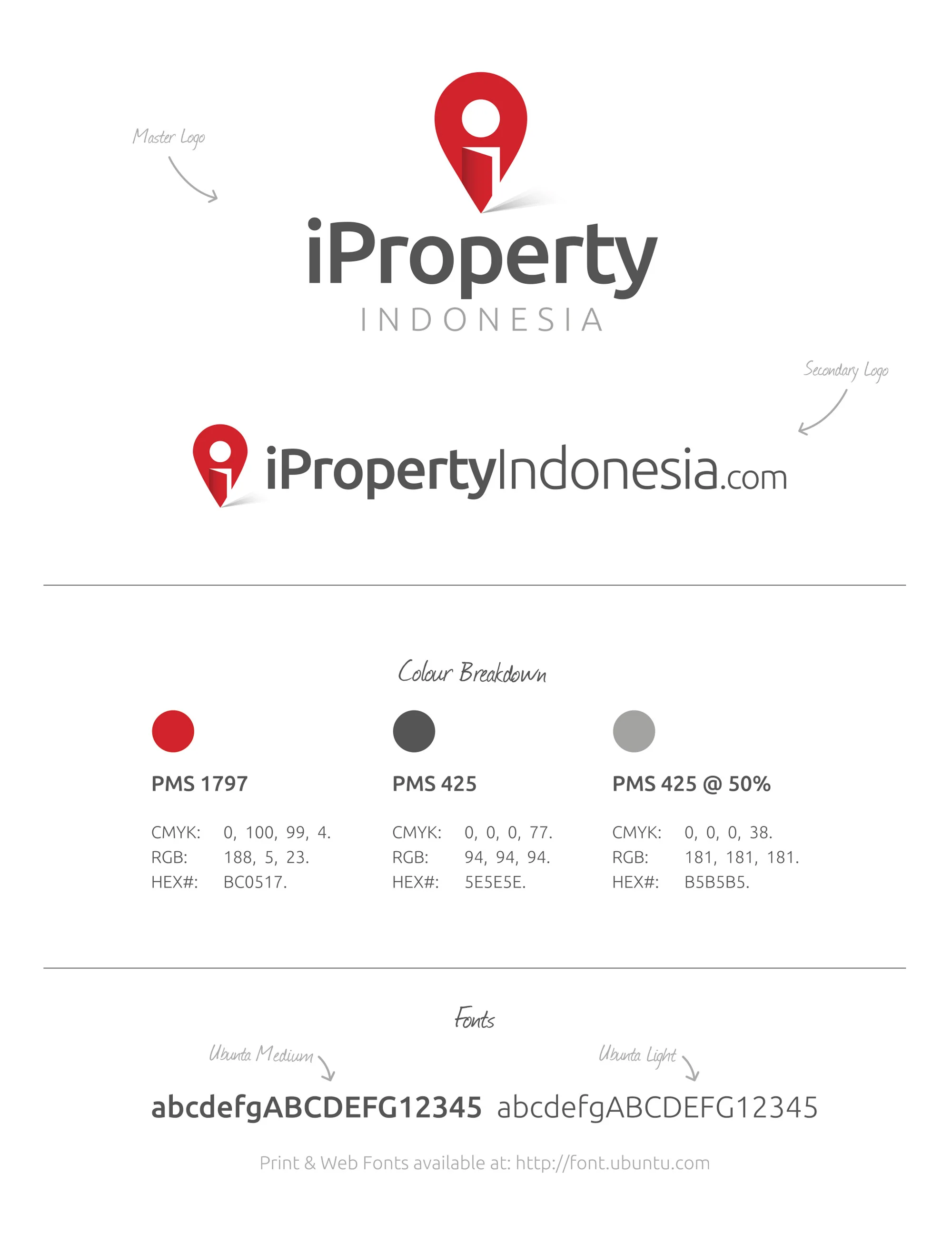
I developed a logo that resembles a map location pin that incorporates an opening door giving the design a homely / dwelling feel. The negative space of the door and circular pin creates the letter 'i' for 'iProperty'. The result in bringing these elements together creates a unique, easily recognisable icon. Red was chosen for it's boldness and strength and is also used in the Indonesian flag.


Designed by: Craig Thorne