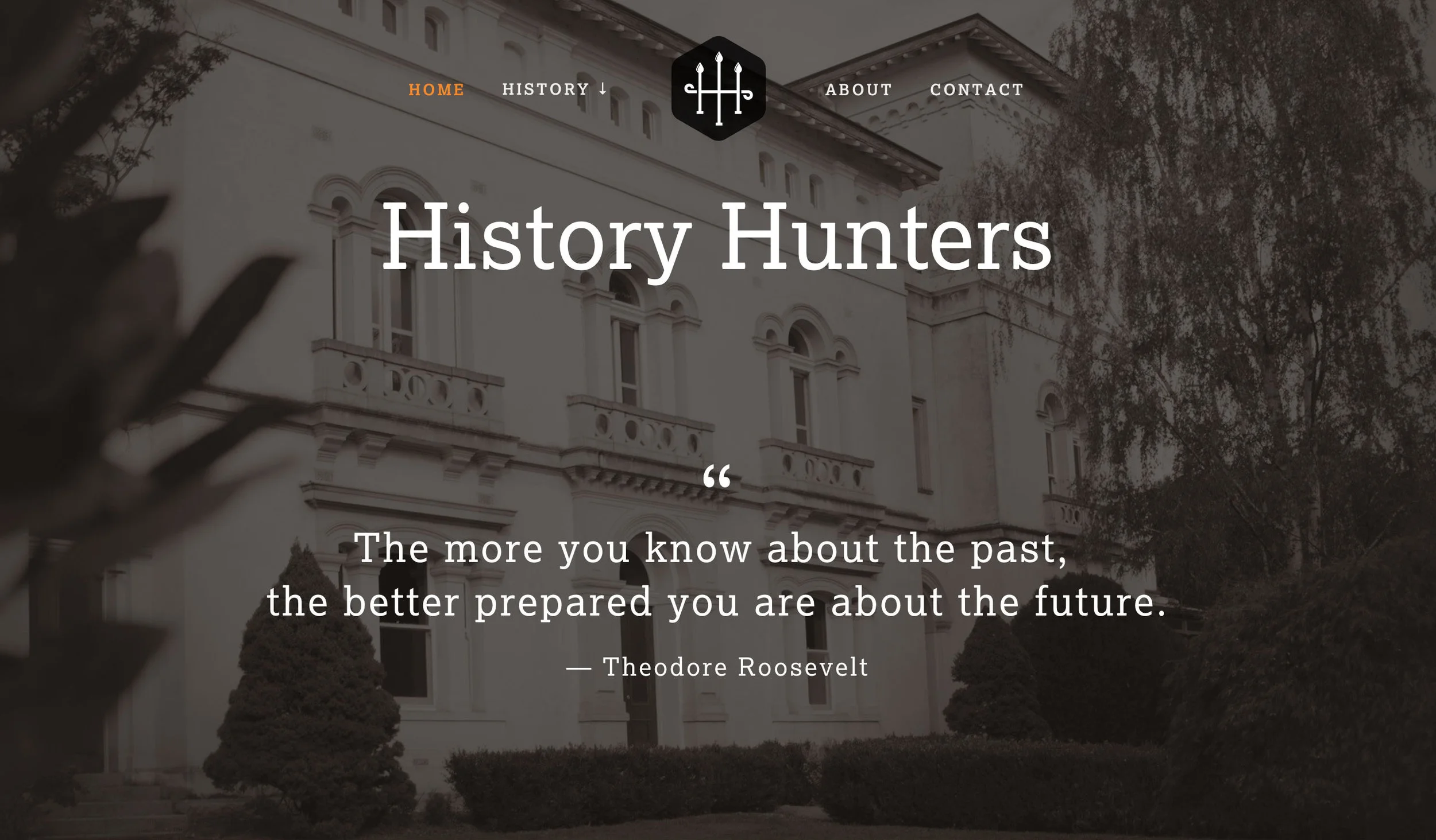
History Hunters
History Hunters is a group of mates with a passion for photography and telling stories of forgotten buildings, historic landscapes and memorable characters.
– The Brief –
The brief was to create a memorable brand with a historic connection. A symbol of 2 connected 'H's was developed in a style of traditional forged iron bars typically found on fences of period homes. Once the logo was finalised, branding continued to be developed in print stationery, social media content through to website. It was important to keep the styling consistent across all forms of communication.
– ABOUT HISTORY HUNTERS –
History Hunters is a group of mates with a passion for photography and telling stories of forgotten buildings, historic landscapes and memorable characters.
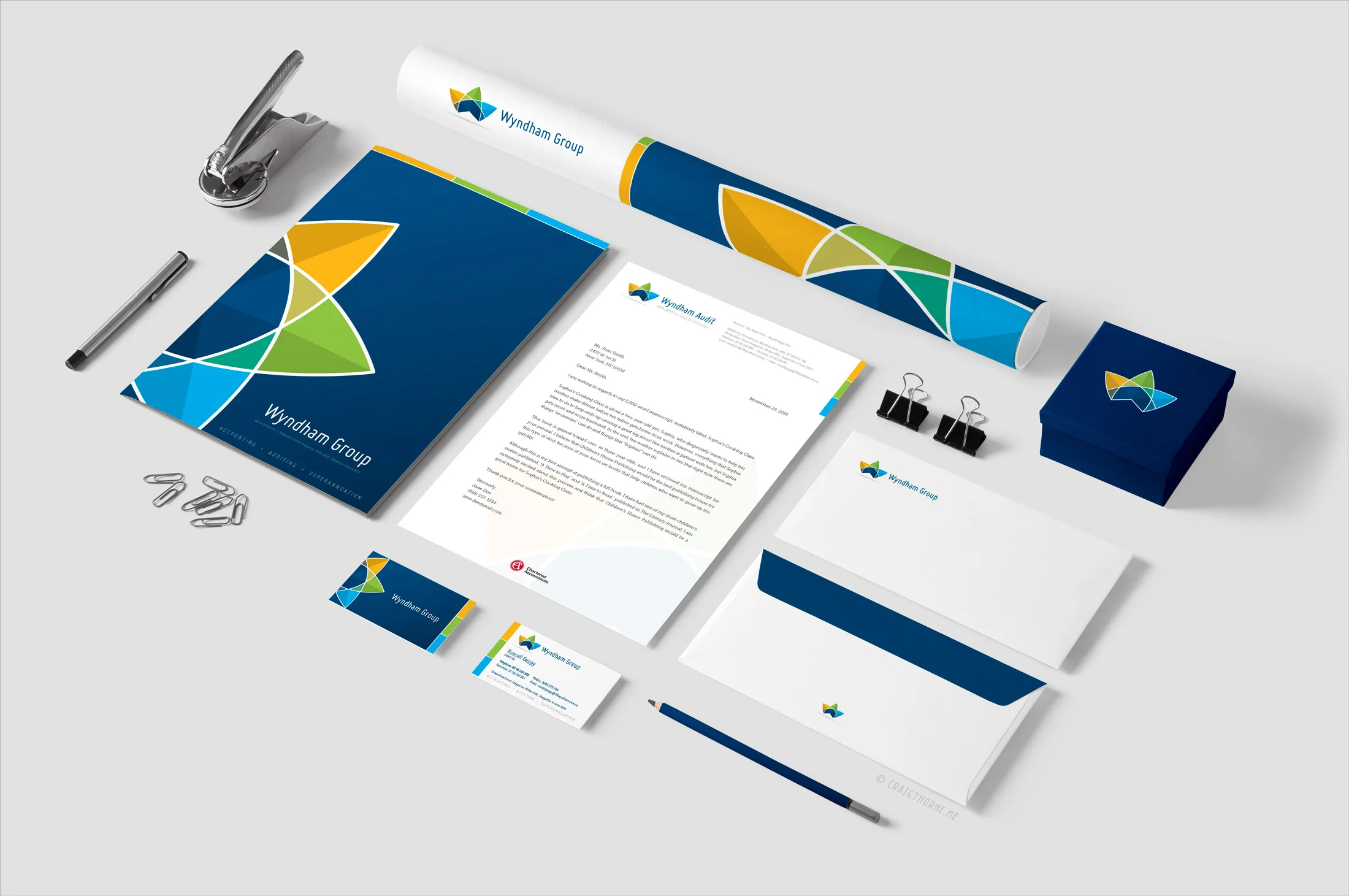
Wyndham Group Branding
Wyndham Group is a accountancy firm based in Shepparton which is located in the Goulburn Valley region.
Wyndham Group is a accountancy firm based in Shepparton which is located in the Goulburn Valley region.

Shepparton Camera Club Brand Design
Shepparton Camera Club is a small group who meet monthly to share their passion for photography.
Shepparton Camera Club is a small group who meet monthly to share their passion for photography.


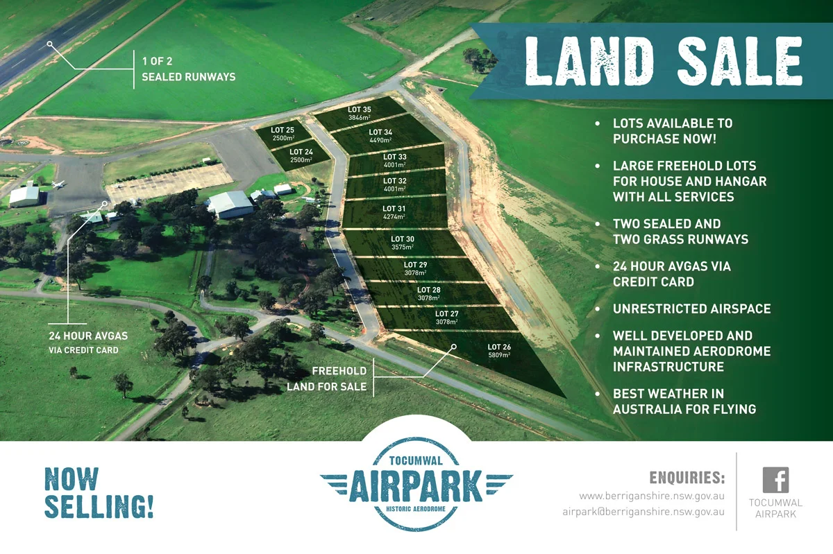
Tocumwal AirPark
The Tocumwal Historic Aerodrome in conjunction with the Berrigan Shire wanted to promote a new land development based at the historic airfield at Tocumwal.
Tocumwal AirPark Brand and Marketing
The Tocumwal Historic Aerodrome in conjunction with the Berrigan Shire wanted to promote a new land development based at the historic airfield at Tocumwal. The development provided an unique opportunity for aviation enthusiasts to purchase a large residential building site capable of housing an aircraft hanger with runway access.
– BRANDMARK –
A brandmark (logo) was developed that reflects the heritage of the airfield site. It was important the logo was easily recognisable and versatile as it was to be used across all forms of media, i.e. signage, press ads, web & TV.
– SIGNAGE –
It was important to show the easy accessibility to the airfield and it's services. A large 3.6m x 2.4m billboard was designed highlighting the airfield's runway & Avgas facilities. The Billboard was erected on the main entry to the development site.
NOTE: Within six months stage 2 had almost sold out.
– PRESS ADS –
Press ads were created for national aviation magazines and rural based newspapers to promote the land sale.
– BRAND ASSETS –
Additional branding assets were created to provide a consistent look across all marketing.
Tocumwal AirPark brand and marketing material designed by Craig Thorne © 2014

Pusen Branding
New branding for Pusen Medical, suppliers of precision medical equipment accross the world.
Pusen Medical supplies precision medical equipment to many countries across the world.
– THE BRIEF –
Pusen Medical required a brand that reflected their high end precision equipment. The brand needed to be clean, modern and invoke a sense of trust. It was important the brand worked at different sizes as it may be used on very small pieces of equipment.
– THE SOLUTION –
I develop a clean typeface that is set on a symmetrical grid. The use of thin lines allows the logo to be sized quite small and is still very readable. Using symmetry in the design helps convey a sense of precision that reflects the company's high standards.


