
Sharcore Constructions
Sharcore Construction - Logo and Brand Design
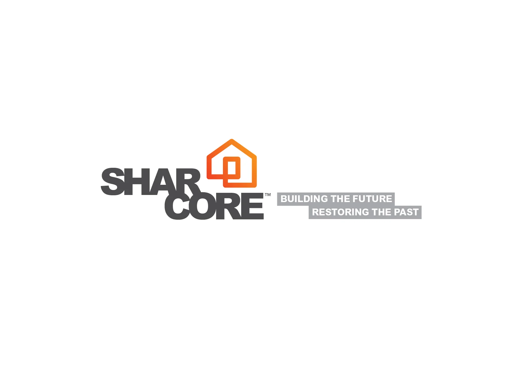
DESIGN BRIEF
Create an unique brand mark that sets “Sharcore Constructions” apart from their opposition.
New logo design is to be; bold, eye-catching and clearly identifiable from a distance. The design needs to be versatile as vehicle signage must work on both light (White) and dark (Charcoal) coloured vehicles & trailers.
It was suggested to keep existing corporate colours of; Orange, Black/Grey & White although, consideration will be give to other colour options if presented. The design and/or elements of the design need to work as social media icon for consistent branding. EG. Facebook Circular Icon
Consideration to be given to the fact that 'Sharcore' is sometimes referred to as 'Share-Core'.
The Solution
The new, ‘Sharcore Constructions’ logo has been designed to be clean, bold and easily recognisable. Using clean lines and striking colour creates impact. A ‘house’ icon was designed to add a visual element that is easily identifiable. Also splitting the word Sharcore helps readability of the words ‘Shar’ and ‘Core’ hopefully reduce the misinterpretation of ‘Share-care’.
The design is strong, bold and versatile which works well on both light and dark backgrounds.


SHARCORE Website: http://sharcore.com.au/

In-Pearl Jewels
In-Pearl Jewels.
8pp Brochure Design and Print Management by Craig Thorne
In-Pearl Jewels
8pp Brochure Design and Print Management by Craig Thorne


NOTE: Photography for this project was supplied by client.
Shepp Show Branding
In 2015, the Shepparton Agricultural Society wanted to rejuvenate their annual show with a focus on bringing back more agricultural for families to enjoy...
In 2015, the Shepparton Agricultural Society wanted to rejuvenate their annual show with a focus on bringing back more agricultural for families to enjoy. The goal was to provide a family friendly atmosphere with hands-on displays showcasing local food, agriculture and entertainment.
– THE BRIEF –
I was asked to develop a new identity for the 'Shepparton Agricultural Show' that was fun, energetic and represents the region's agriculture industry.
– The solution –
The new logo was designed to be cheerful and inviting with a focus on engaging with families. A cheerful cow mascot was designed to add personality that also links to the region's agricultural industry. In my research I found that most people referred to the show as simply 'Shepp Show'. It was decided to run with this keeping the name short and punchy.
A 'name the mascot' competition was held to promote the new brand and generate interest in the upcoming show. It was a great success and the new name was chosen...
'Maisie Moo'
Above is a food manufactures application form.
2015 event program cover.
2015 Showgrounds Event Map [click to enlarge]
Sample merchandise.
Display flags were used to promote the show in the weeks prior.

Kialla Lakes Estate
Kialla Lakes Sub-Division Stage 35a & 35B plan artwork
Sub-division plan artwork and promotional press-ad for Kialla Lakes Estate
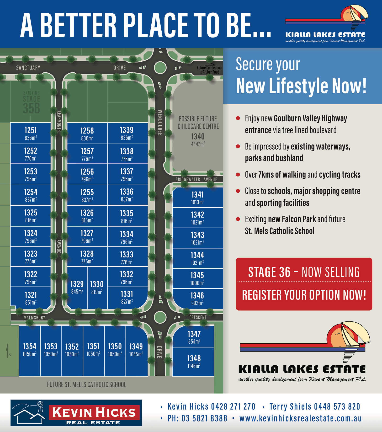
STAGE 36 - Press Ad
STAGE 35a & 35b Press Ad