
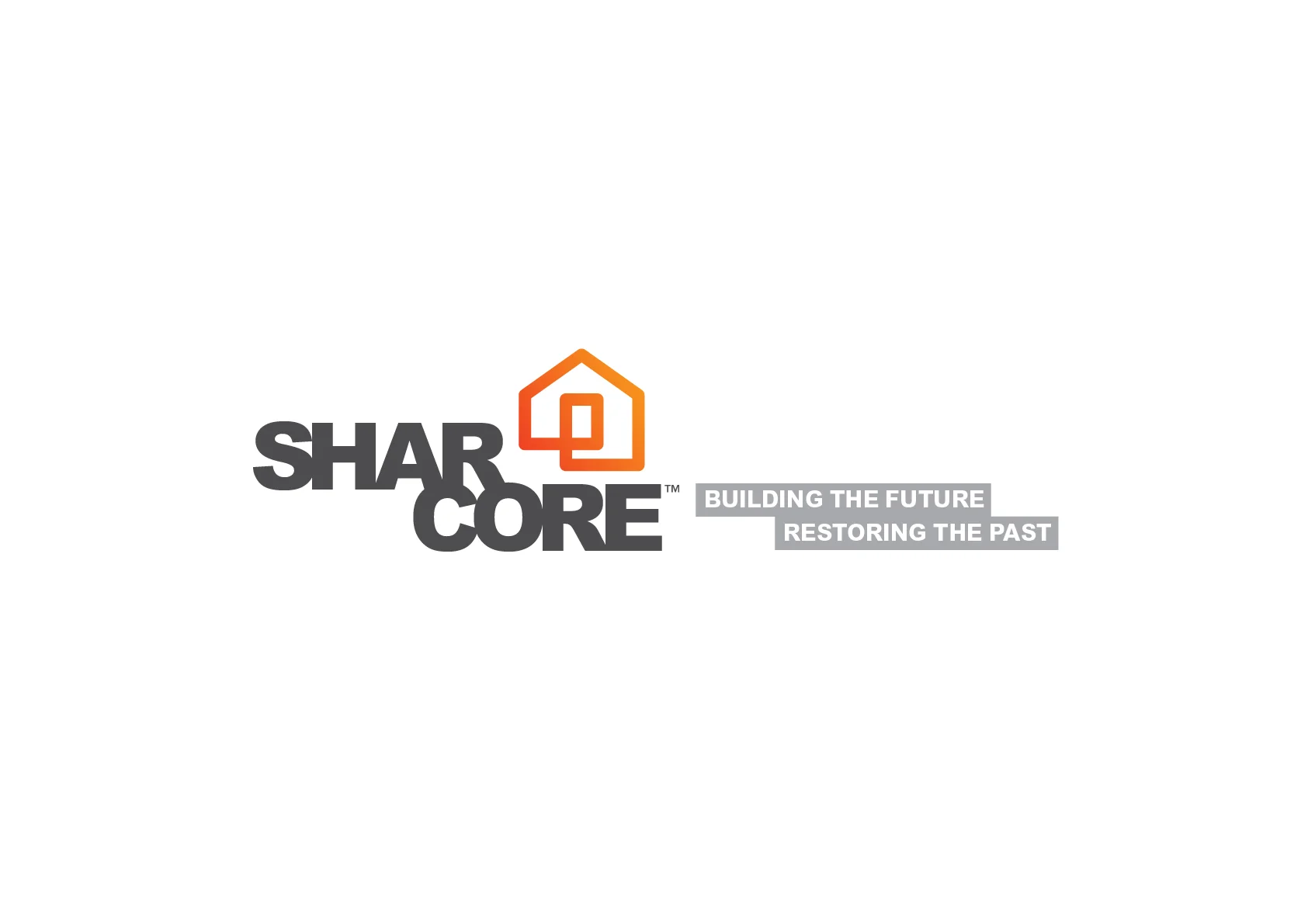
Sharcore Constructions
Sharcore Construction - Logo and Brand Design
DESIGN BRIEF
Create an unique brand mark that sets “Sharcore Constructions” apart from their opposition.
New logo design is to be; bold, eye-catching and clearly identifiable from a distance. The design needs to be versatile as vehicle signage must work on both light (White) and dark (Charcoal) coloured vehicles & trailers.
It was suggested to keep existing corporate colours of; Orange, Black/Grey & White although, consideration will be give to other colour options if presented. The design and/or elements of the design need to work as social media icon for consistent branding. EG. Facebook Circular Icon
Consideration to be given to the fact that 'Sharcore' is sometimes referred to as 'Share-Core'.
The Solution
The new, ‘Sharcore Constructions’ logo has been designed to be clean, bold and easily recognisable. Using clean lines and striking colour creates impact. A ‘house’ icon was designed to add a visual element that is easily identifiable. Also splitting the word Sharcore helps readability of the words ‘Shar’ and ‘Core’ hopefully reduce the misinterpretation of ‘Share-care’.
The design is strong, bold and versatile which works well on both light and dark backgrounds.


SHARCORE Website: http://sharcore.com.au/
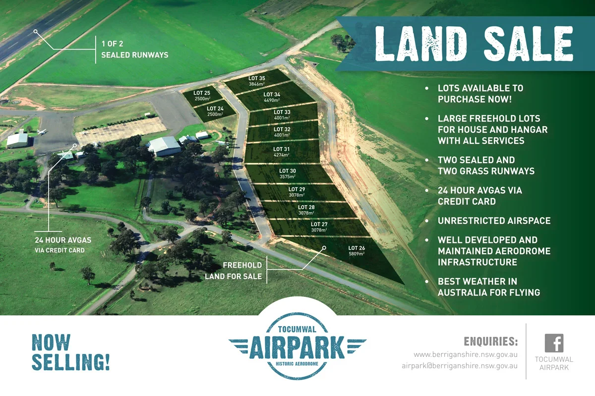
Tocumwal AirPark
The Tocumwal Historic Aerodrome in conjunction with the Berrigan Shire wanted to promote a new land development based at the historic airfield at Tocumwal.
Tocumwal AirPark Brand and Marketing
The Tocumwal Historic Aerodrome in conjunction with the Berrigan Shire wanted to promote a new land development based at the historic airfield at Tocumwal. The development provided an unique opportunity for aviation enthusiasts to purchase a large residential building site capable of housing an aircraft hanger with runway access.
– BRANDMARK –
A brandmark (logo) was developed that reflects the heritage of the airfield site. It was important the logo was easily recognisable and versatile as it was to be used across all forms of media, i.e. signage, press ads, web & TV.
– SIGNAGE –
It was important to show the easy accessibility to the airfield and it's services. A large 3.6m x 2.4m billboard was designed highlighting the airfield's runway & Avgas facilities. The Billboard was erected on the main entry to the development site.
NOTE: Within six months stage 2 had almost sold out.
– PRESS ADS –
Press ads were created for national aviation magazines and rural based newspapers to promote the land sale.
– BRAND ASSETS –
Additional branding assets were created to provide a consistent look across all marketing.
Tocumwal AirPark brand and marketing material designed by Craig Thorne © 2014